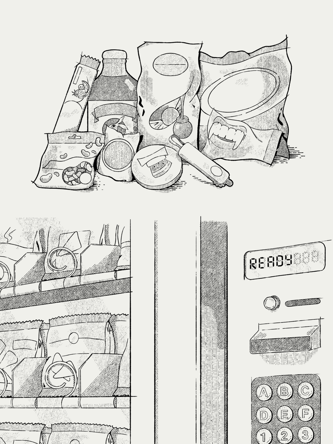
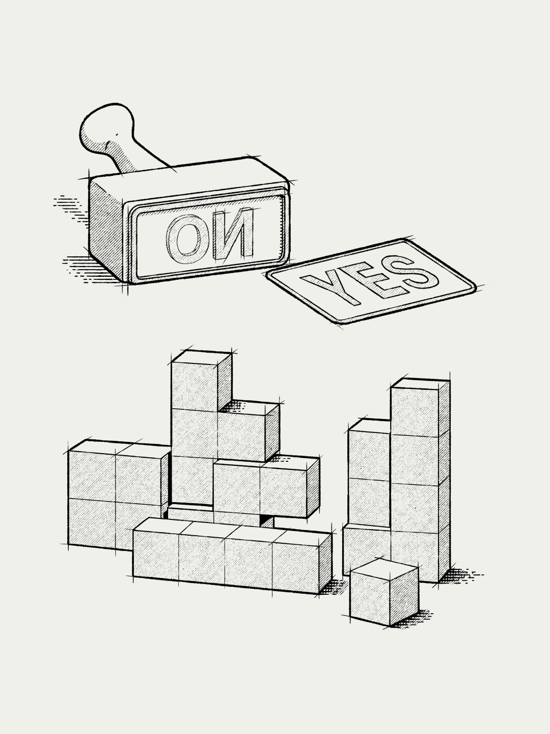
We created a series of infographic illustrations to explain Frontify’s features in a playful and engaging way.
Frontify is a Swiss brand management platform that helps companies manage their visual identity, communication, and all brand assets in an integrated way. To support its communication, we developed a series of illustrated compositions in an infographic format, designed to accompany case studies, articles, and other brand materials. The goal was to translate the platform’s features into visuals that were clear, playful, and consistent with its identity.
The references came from classic science and curiosity magazines. We incorporated elements typical of scientific and botanical illustration, such as hatching, shading, and layered textures, reinterpreted into digital compositions. This approach made it possible to create detailed pieces while maintaining control over contrast and readability.
Since this is a digital product, the work required adaptations to ensure that the graphic richness remained functional across different scales. The focus was on preserving the density of the drawing without generating visual noise, ensuring sharpness and legibility in digital interfaces.

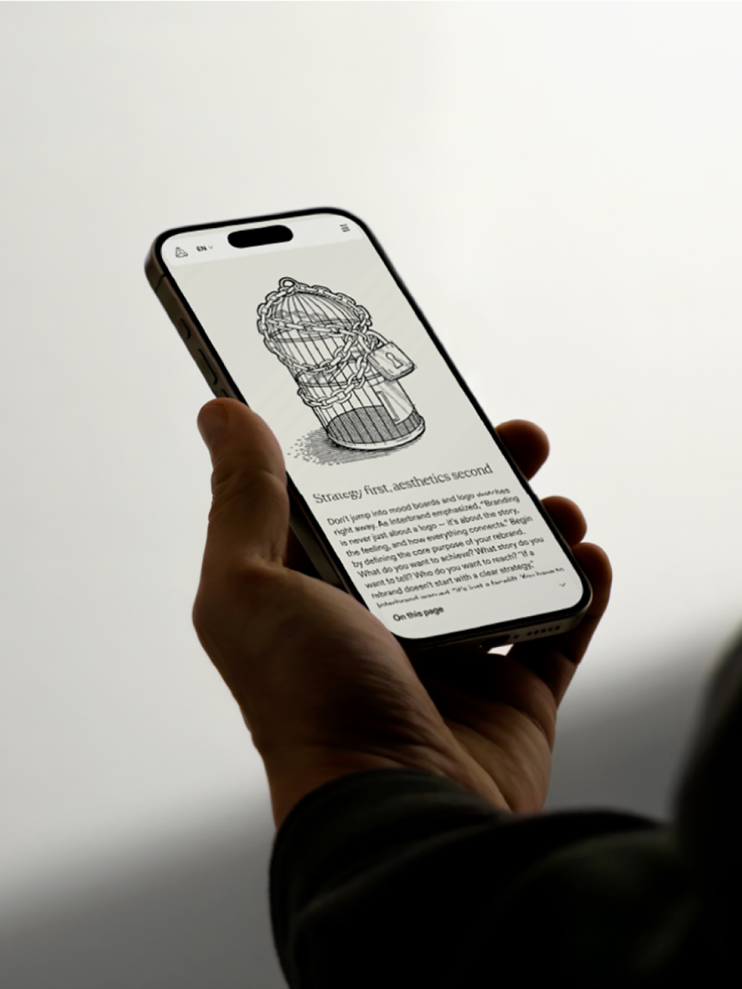
The result is a collection of illustrations that reinforces the brand’s informative character and adds a visual layer inspired by editorial languages, helping make complex content more accessible.