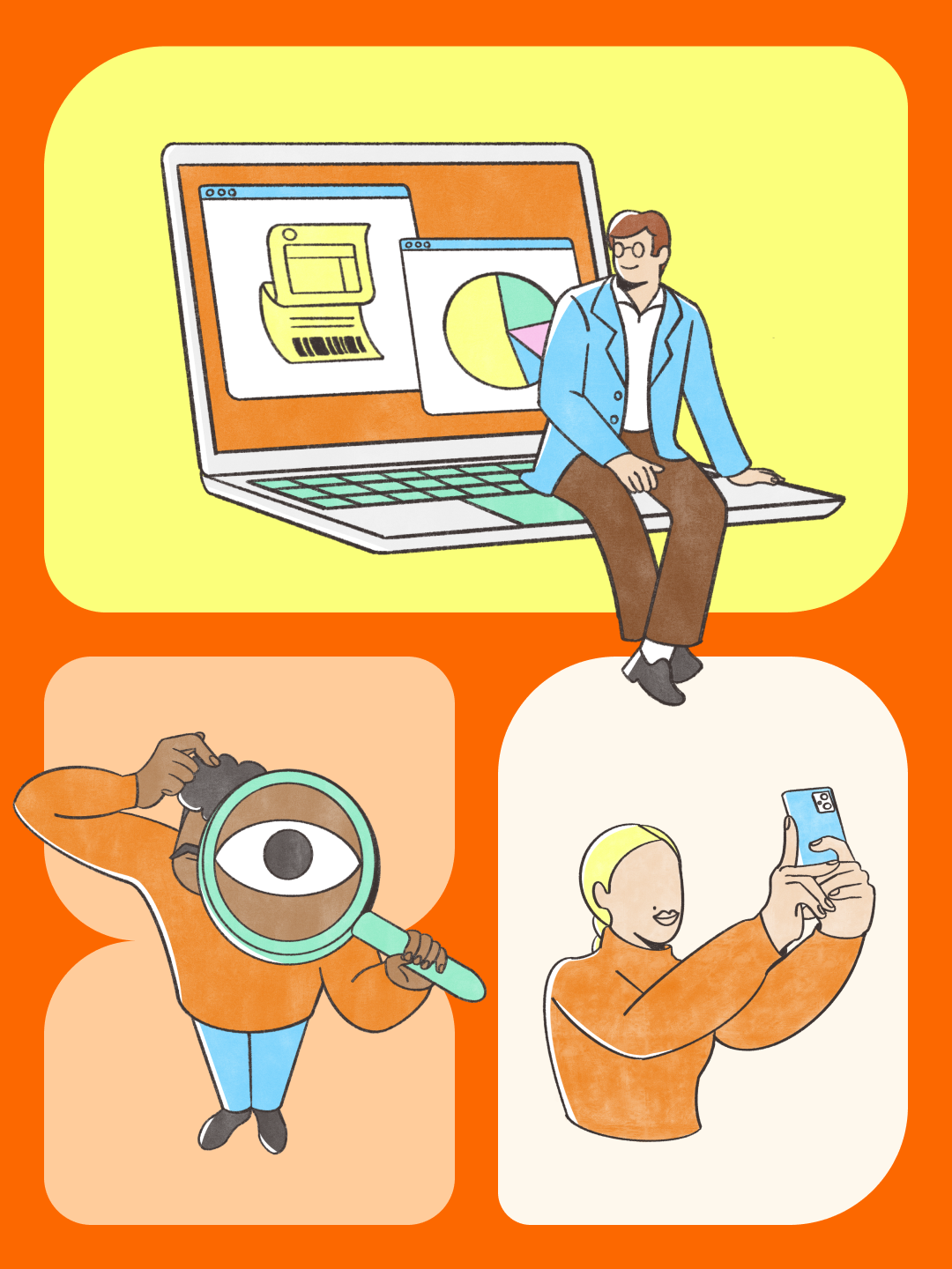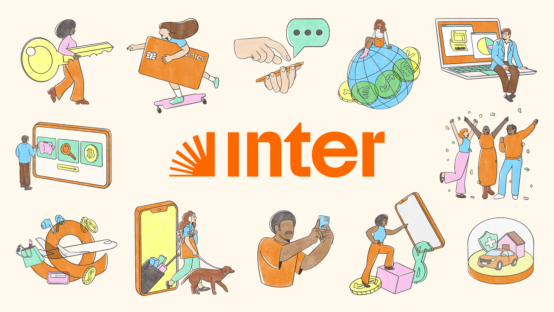
A humanized and versatile illustration system, created to reinforce Inter’s identity and visually translate the concept of the Super App.
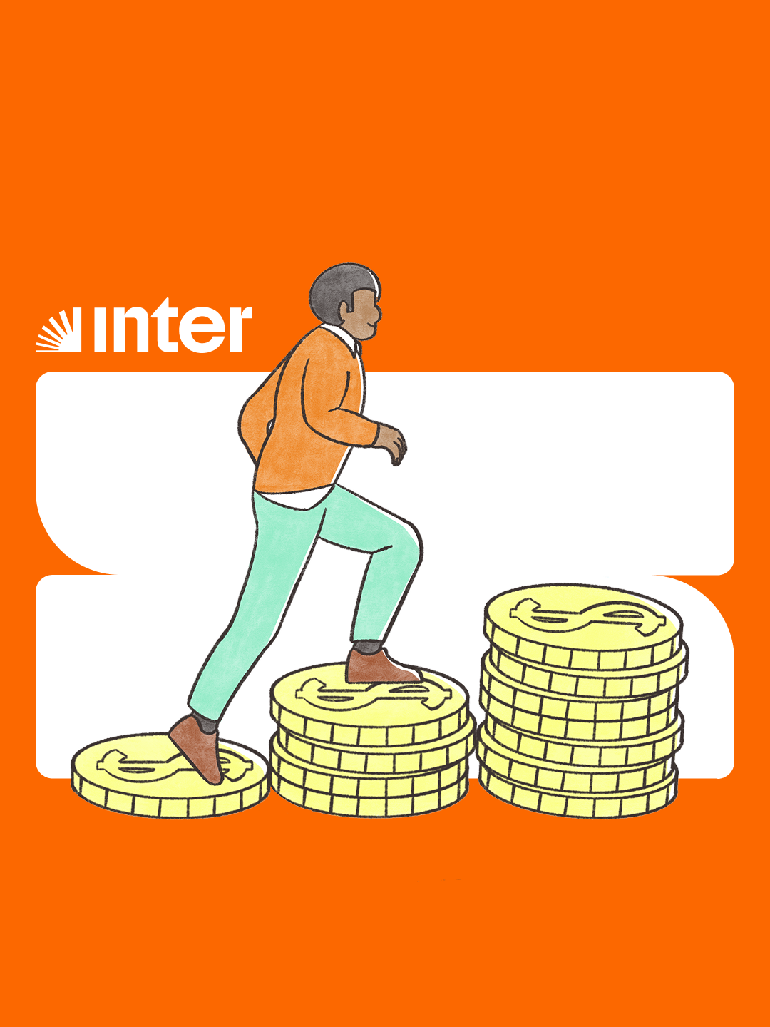
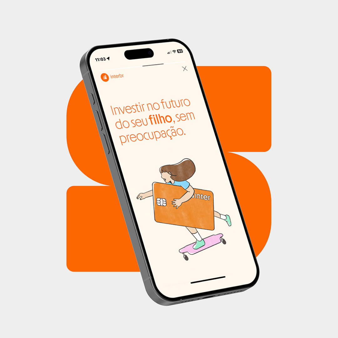
We had the pleasure of developing Inter’s illustration system, a project that involved several stages of creation and close collaboration with the brand’s design team. Dozens of compositions were designed to bring consistency, clarity, and versatility to the brand’s communication, unfolding across campaigns, social media, internal materials, and the digital environment itself.
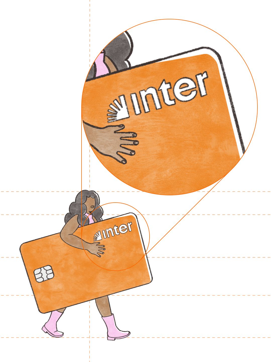
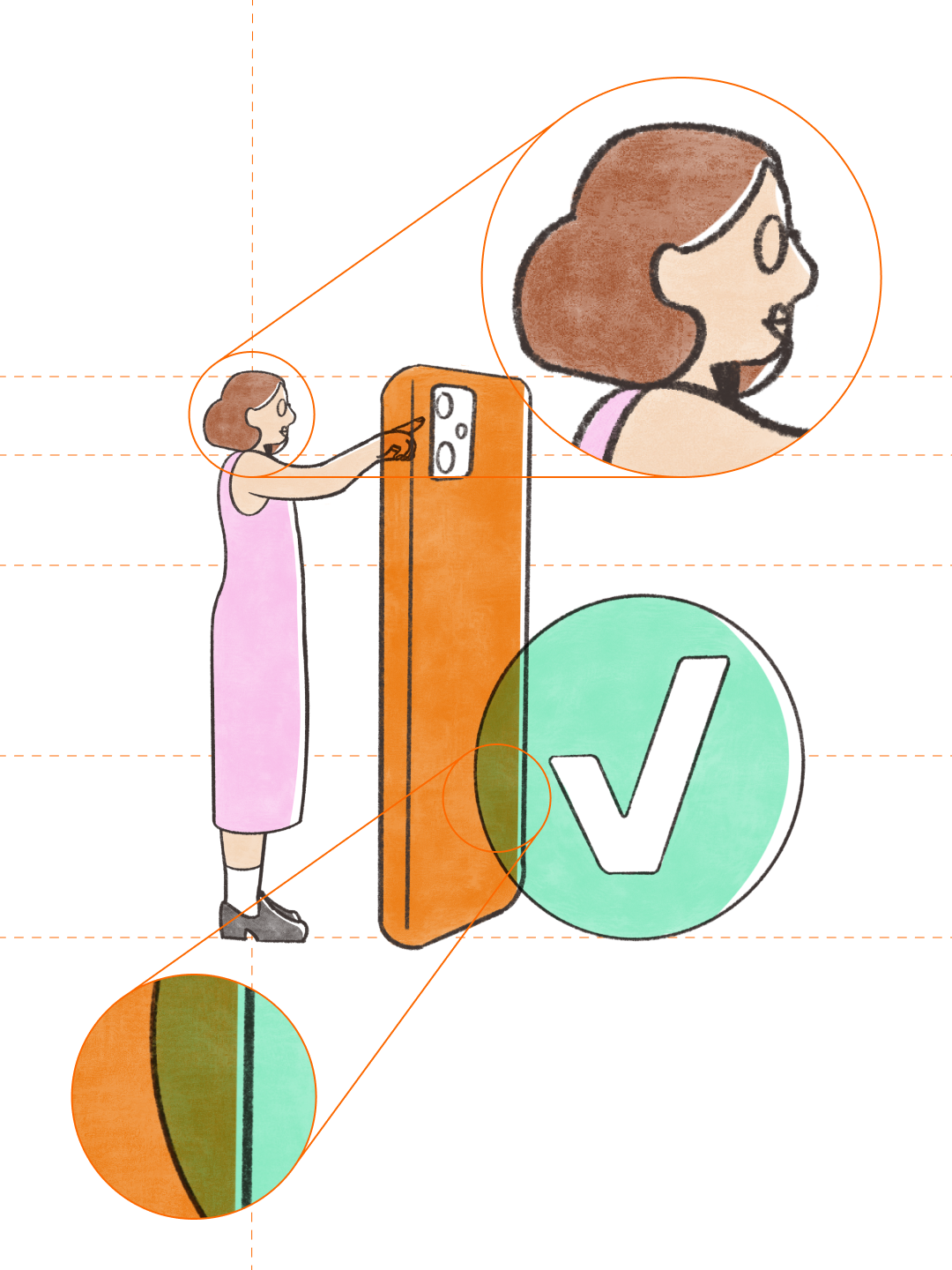
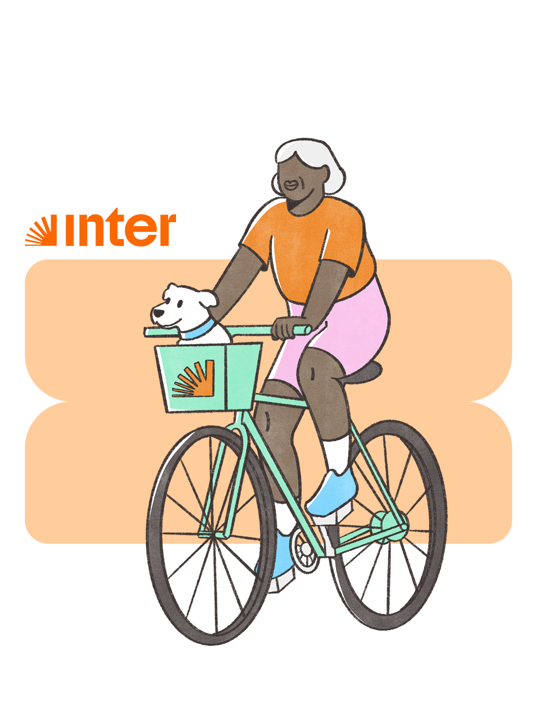
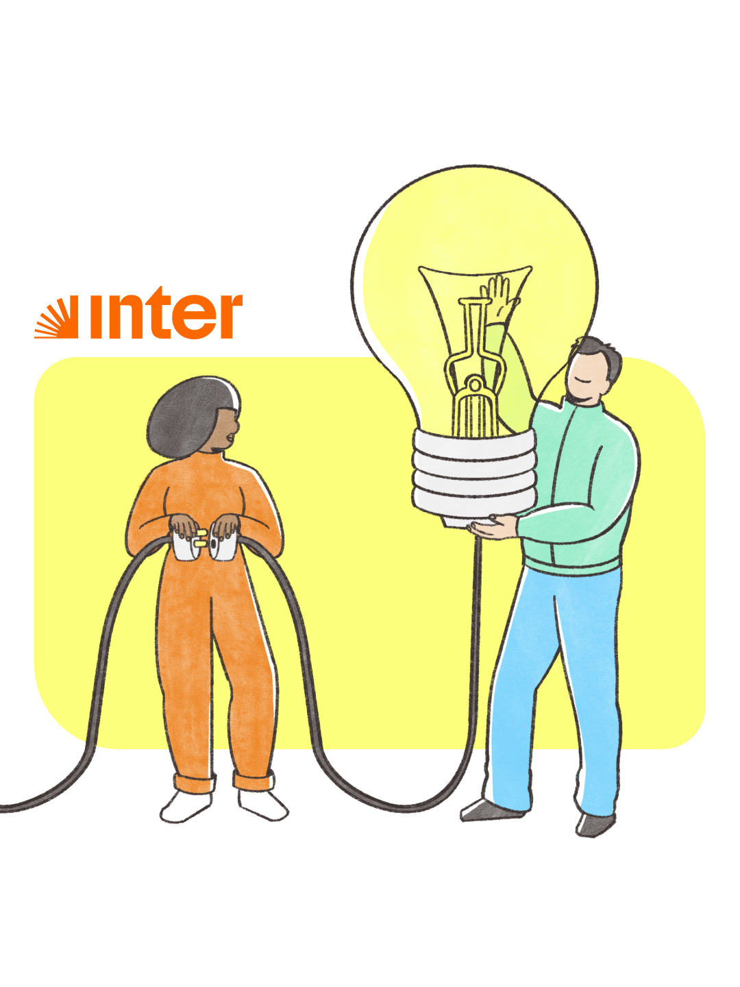
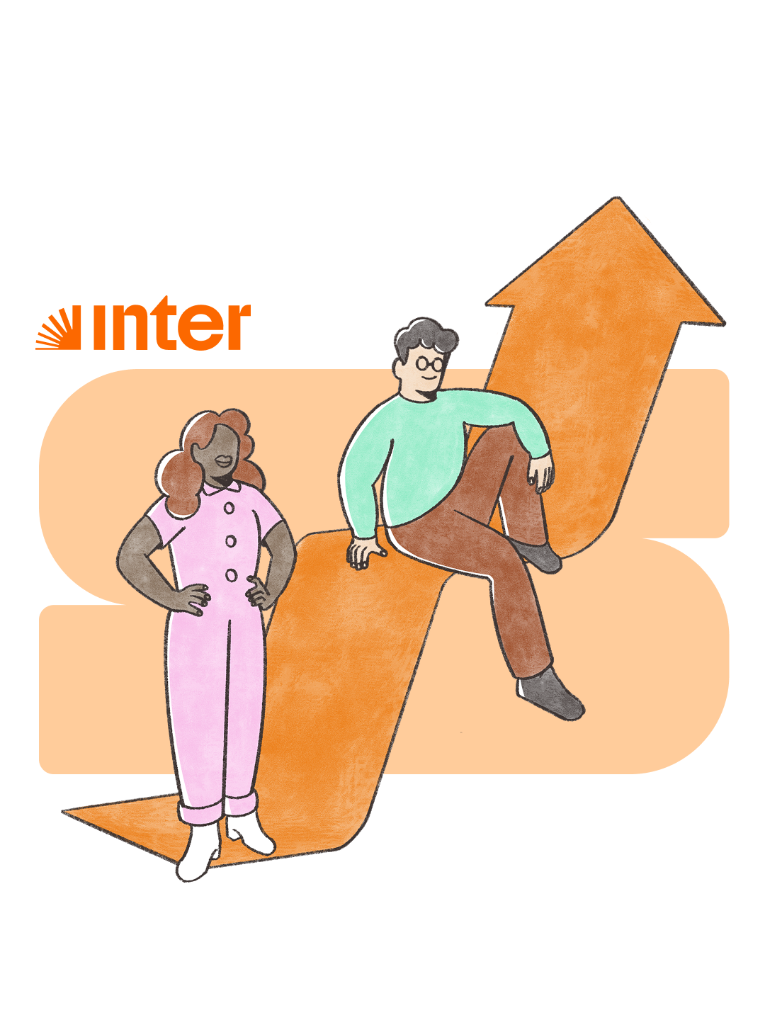
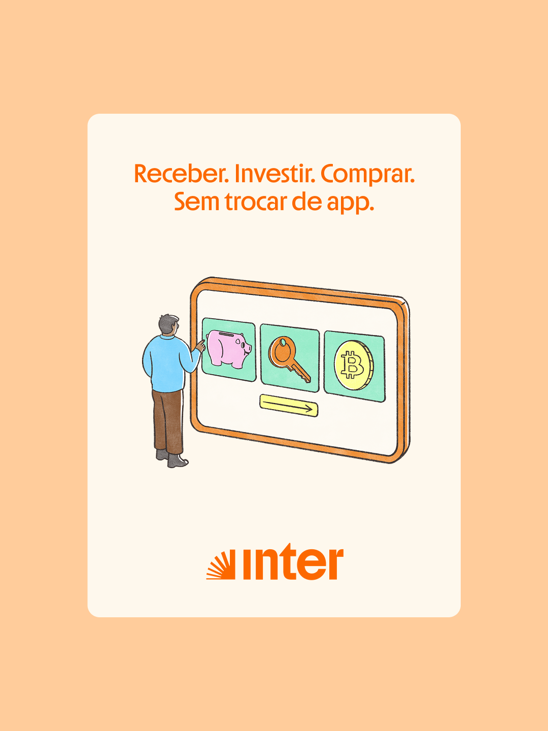
At the core of the concept was the idea of visually representing the wide range of possibilities of the Super App through superobjects, enlarged elements that stand side by side with the characters. This visual strategy highlights the breadth of services and functionalities Inter brings together in a single platform.


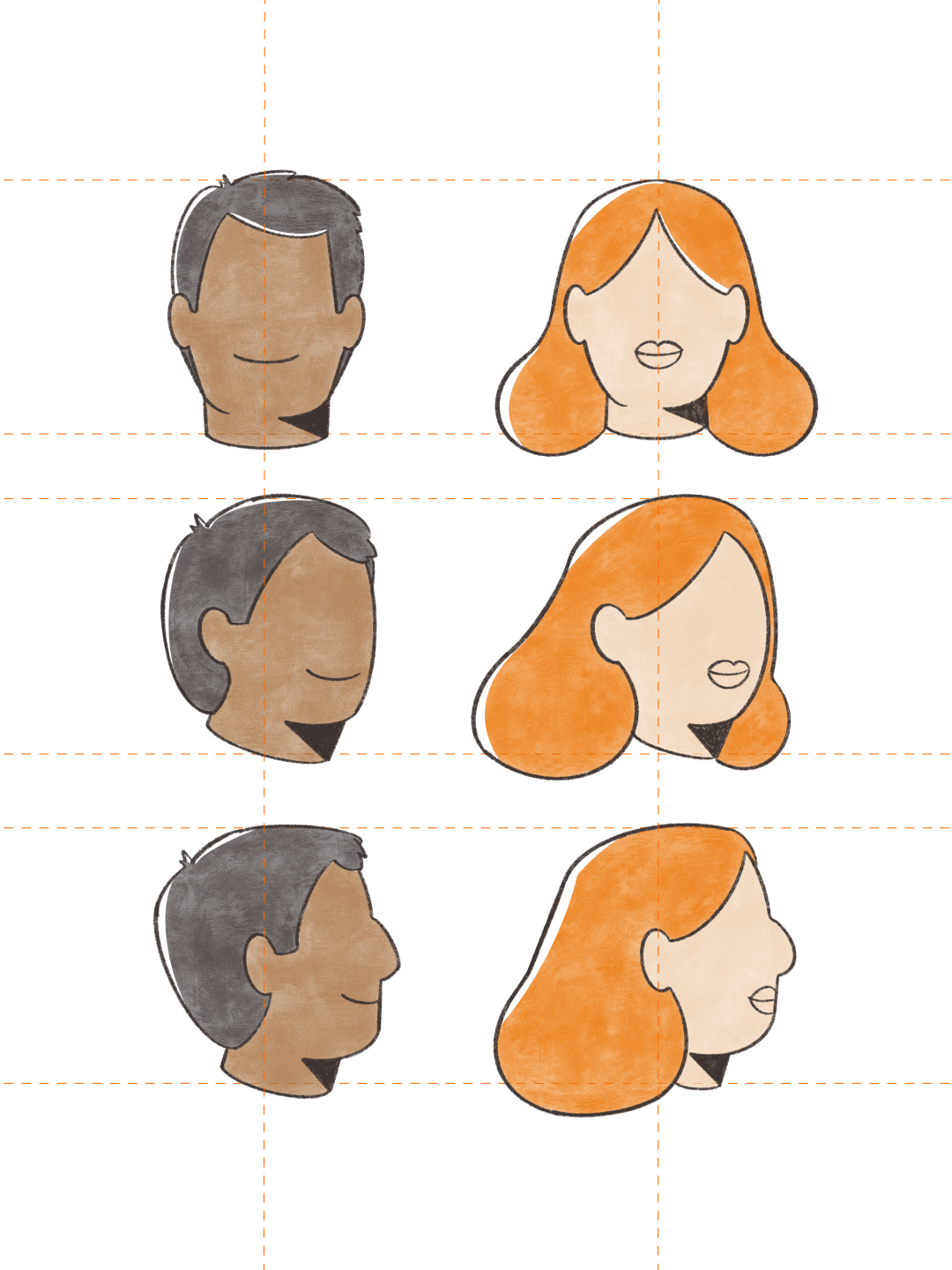
The illustration style values organic lines, textures, and layered colors, bringing diversity, warmth, and humanization to the brand’s communication. This approach creates balance with Inter’s existing identity while also setting it apart within the financial and technology sectors. The result is a robust, expressive, and versatile illustration system, designed to strengthen and bring the brand closer to people across all touchpoints.