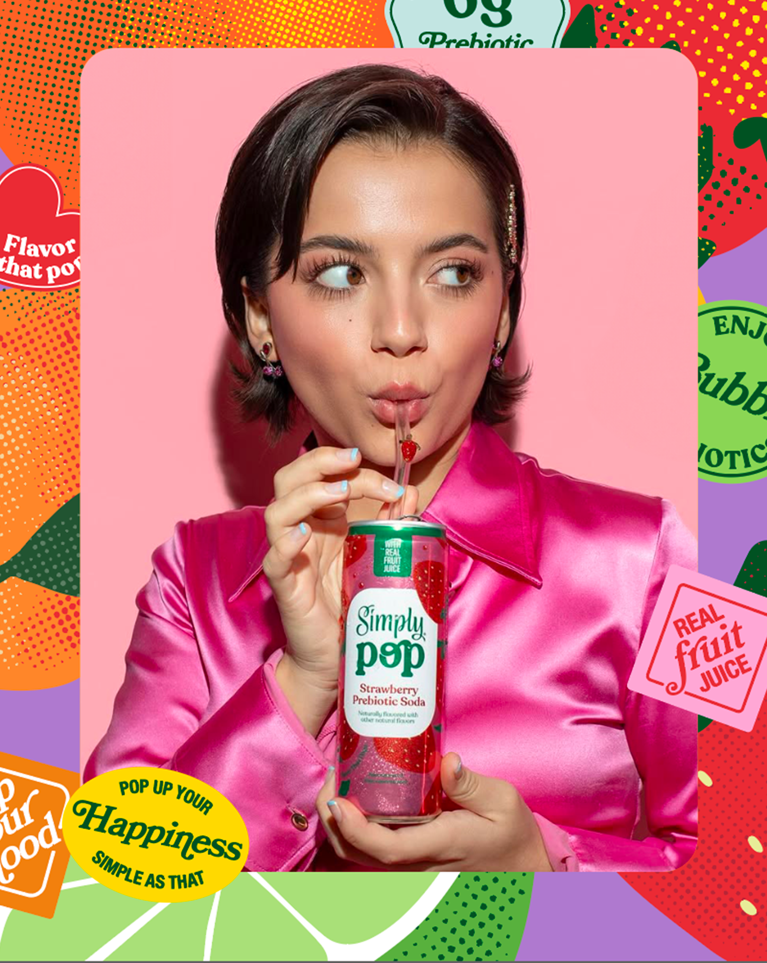
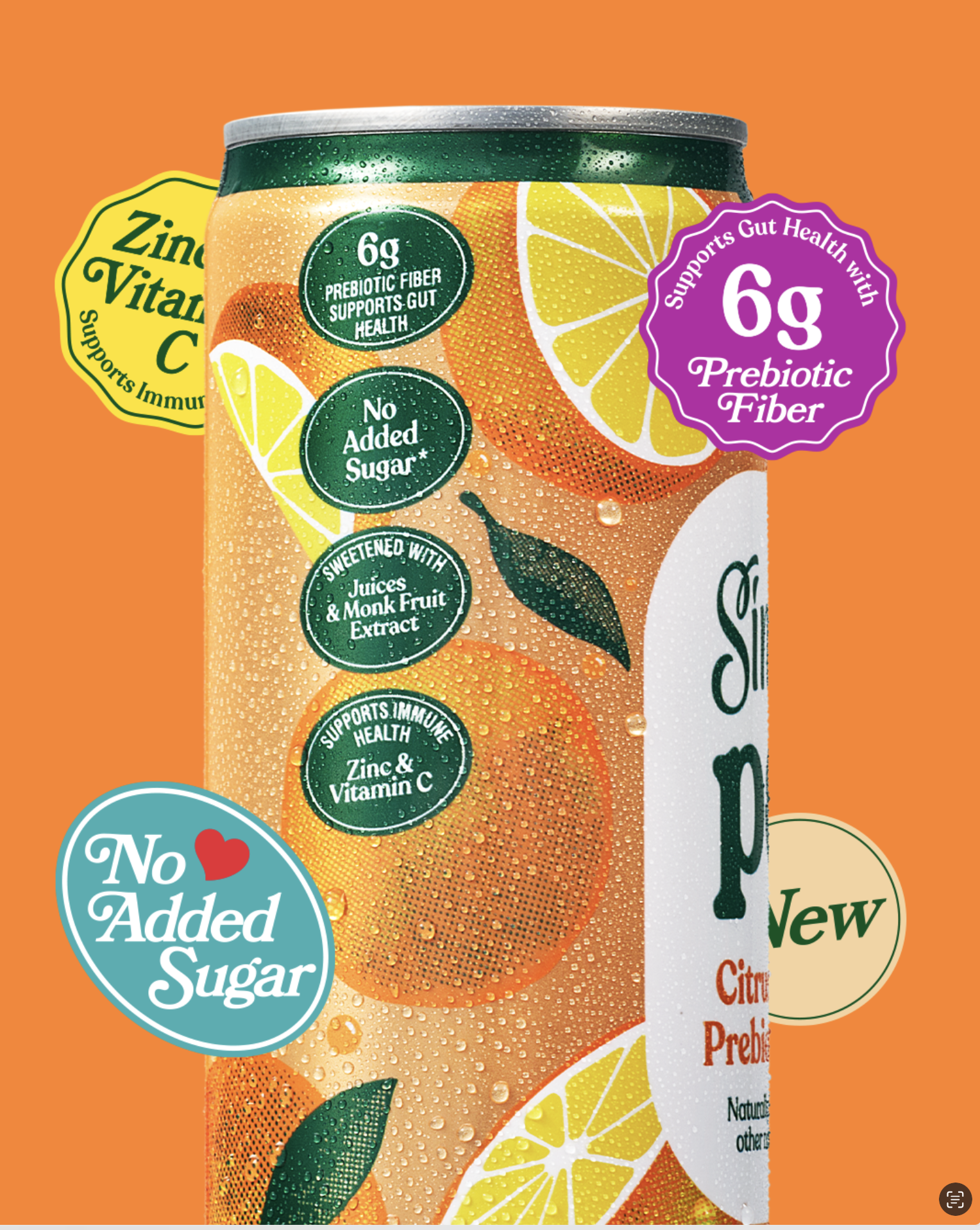
Simply Pop is Coca-Cola North America’s new prebiotic soda. We developed the illustrations that bring the packaging and brand communication to life, translating flavors into graphic presence and consolidating the fruits as central icons of a vibrant, playful and pop identity.

We were invited by Tátil Design to create the illustrations for Simply Pop. Our challenge was to design artworks that would go beyond the labels and help characterize the brand’s entire communication, spanning packaging, OOH, merchandising, and other related materials.
We explored different directions until we reached a visual language that is vibrant, fun and pop, aligned with the brand’s proposal to connect pleasure and well-being with a new generation of consumers. The fruits were treated as central identity elements, becoming iconographic resources in the brand’s construction. The illustrations were created in vector format, with simplified strokes that ensure immediate recognition and expand the range of applications, combined with color halftone graphics that reinforce the playful and contemporary atmosphere of the packaging.
The result is a visual identity that expands the brand’s presence beyond the packaging, translating flavors into graphic form and ensuring consistency across all touchpoints. Simply Pop also marks Coca-Cola North America’s entry into the emerging prebiotic soda category, a strategic move that builds on the established Simply juice brand and responds to consumers seeking lightness, conscious choices, and style.