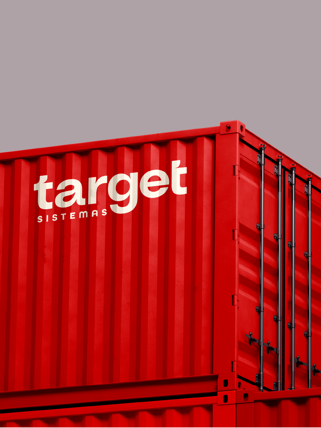
We were responsible for the rebrand of Target Sistemas, a technology company specialized in solutions for logistics management and operations, directly supporting the growth and efficiency of its clients.
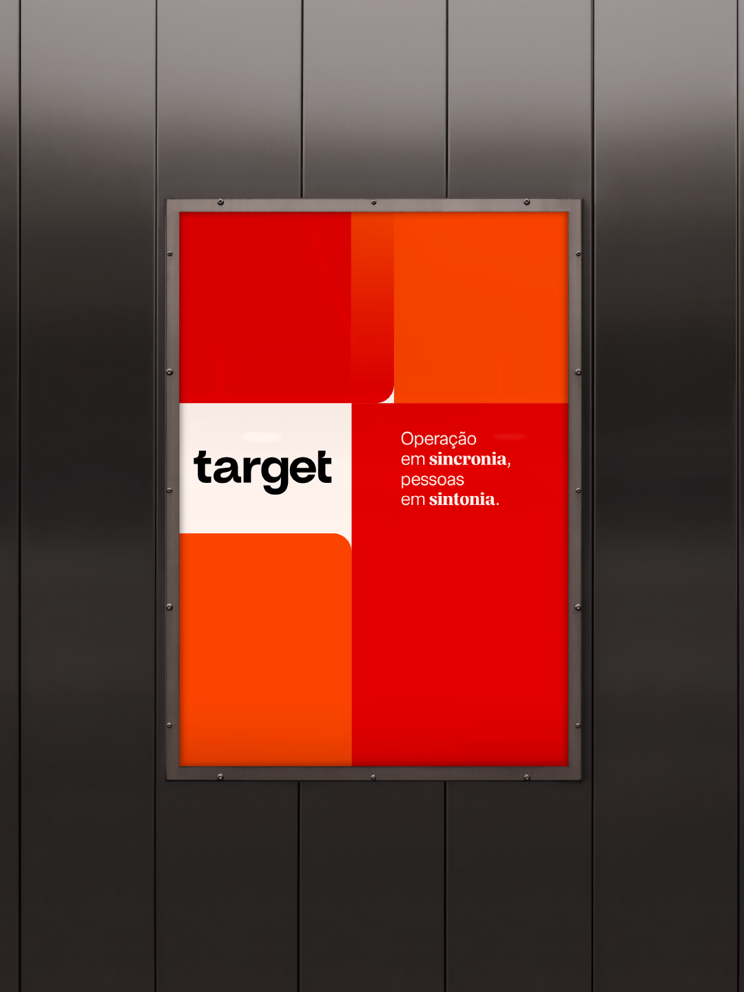
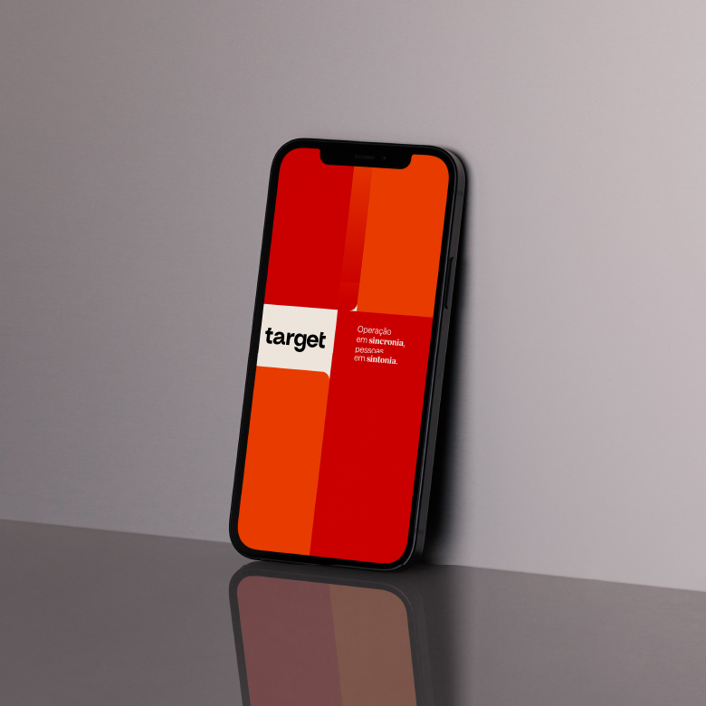
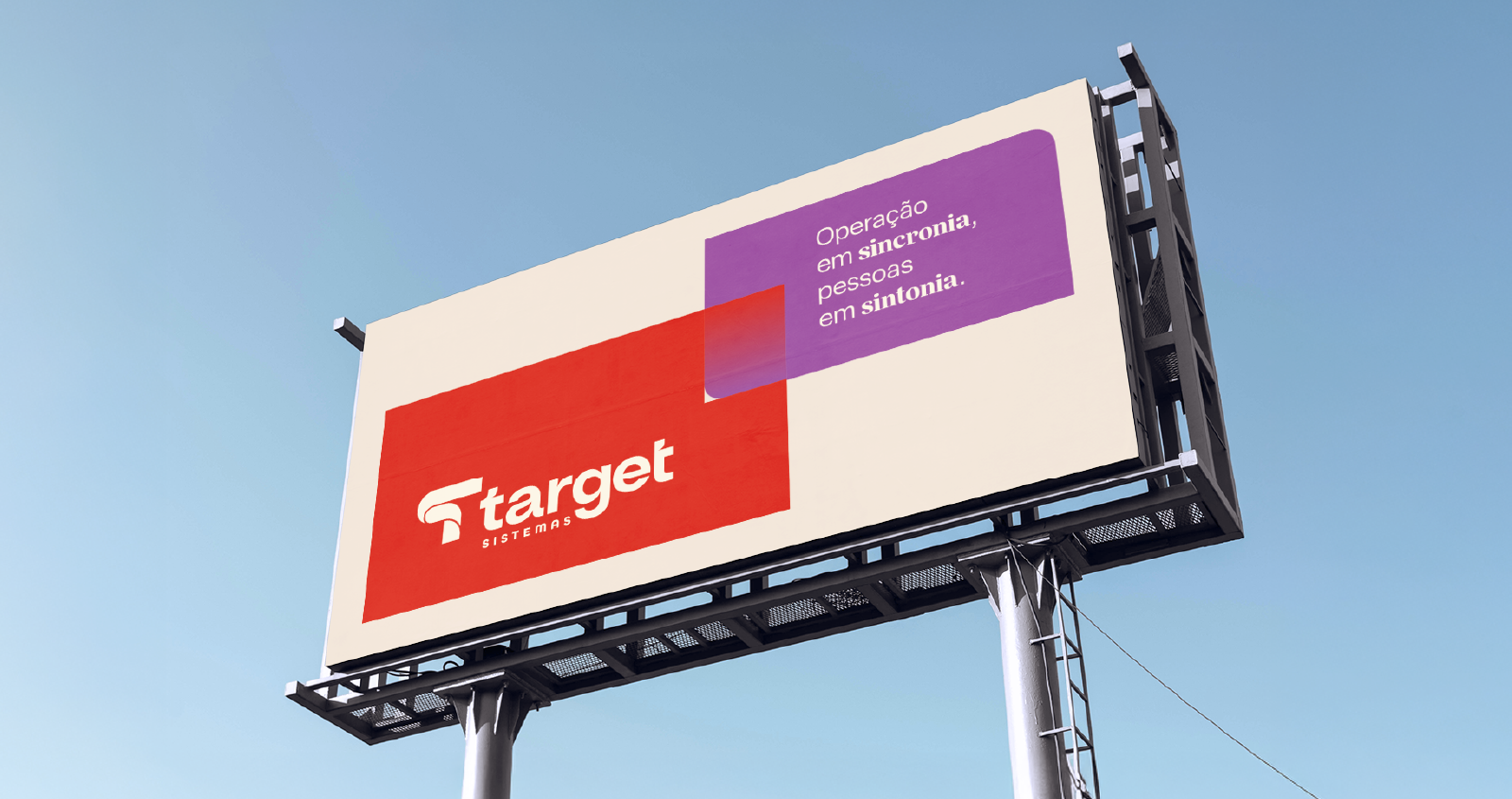
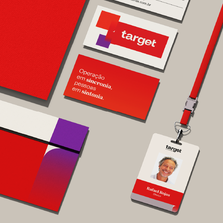
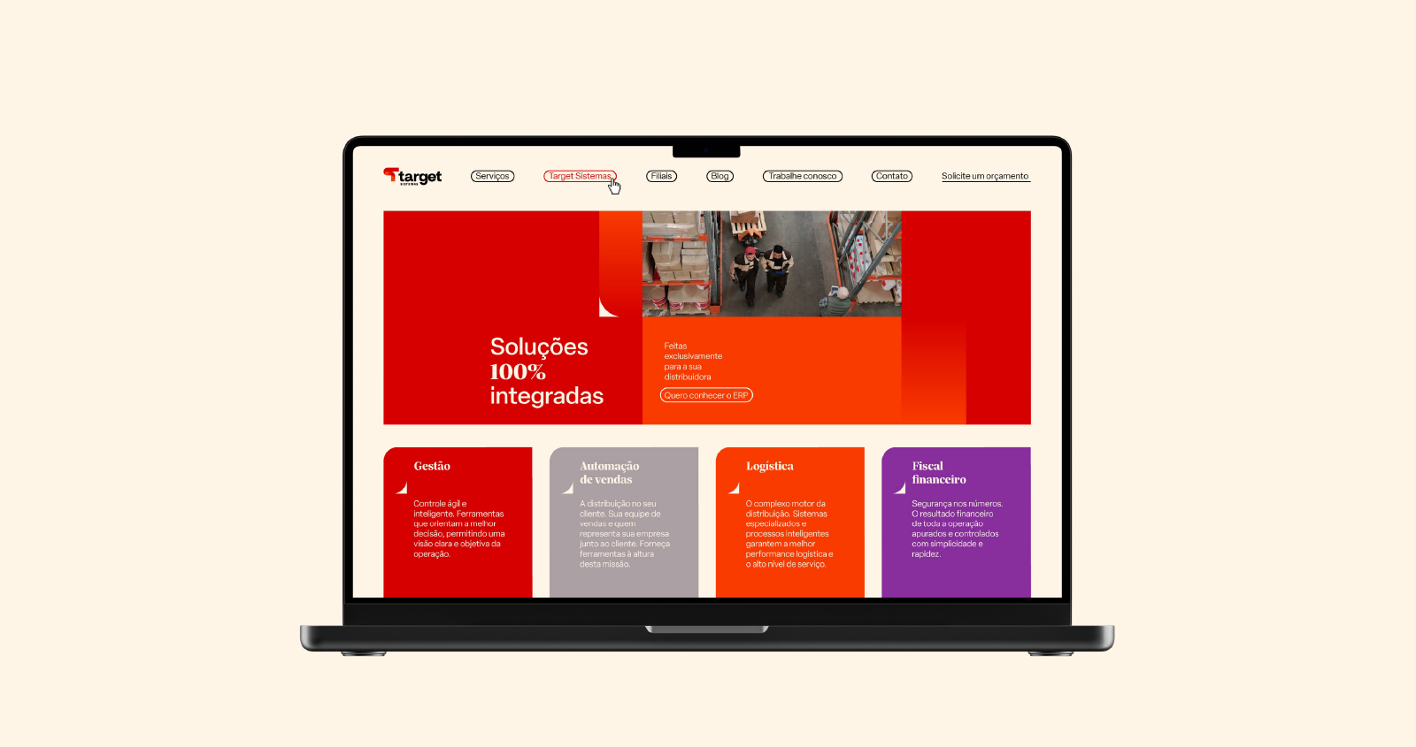
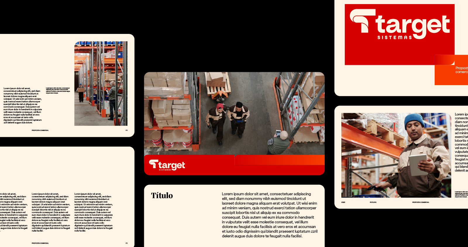
The project involved a complete reconstruction of the brand, including a new logotype and symbol, color palette, iconography, photographic mood, layout system, printed materials, and communication assets.
The new identity was built on the balance between structure and fluidity. Starting from a geometric base associated with technical precision, we introduced softer curves to create a more approachable and dynamic language. This combination guides the entire visual system, allowing it to move consistently between rigor and flexibility.
Colors, shapes, and gradients work together to suggest continuous transformation. Across layouts, these elements create paths and connections that guide the eye, reinforcing ideas of flow, integration, and networked operations, key concepts within the logistics universe.
The result is a solid and adaptable visual system, designed to perform across multiple touchpoints, positioning Target as a strategic partner in the growth of its clients.