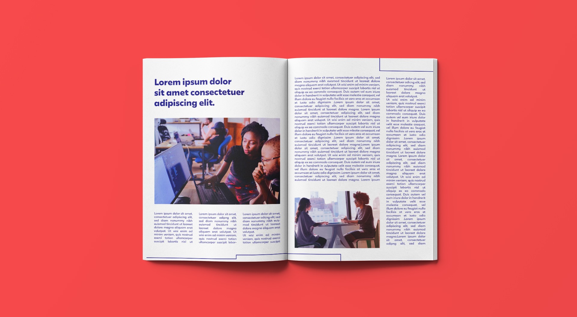
Evolucional is an innovative company that uses technology to produce in-person and virtual simulations pedagogically aligned with the ENEM - Test performed to provide high school students access to universities. Through data analysis, the company helps schools identify their weaknesses and improve their teaching performance.


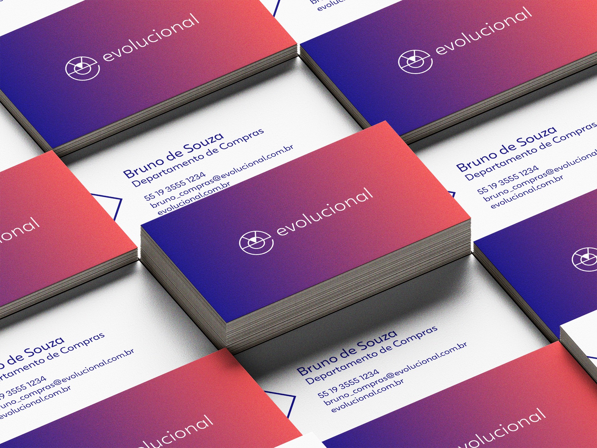
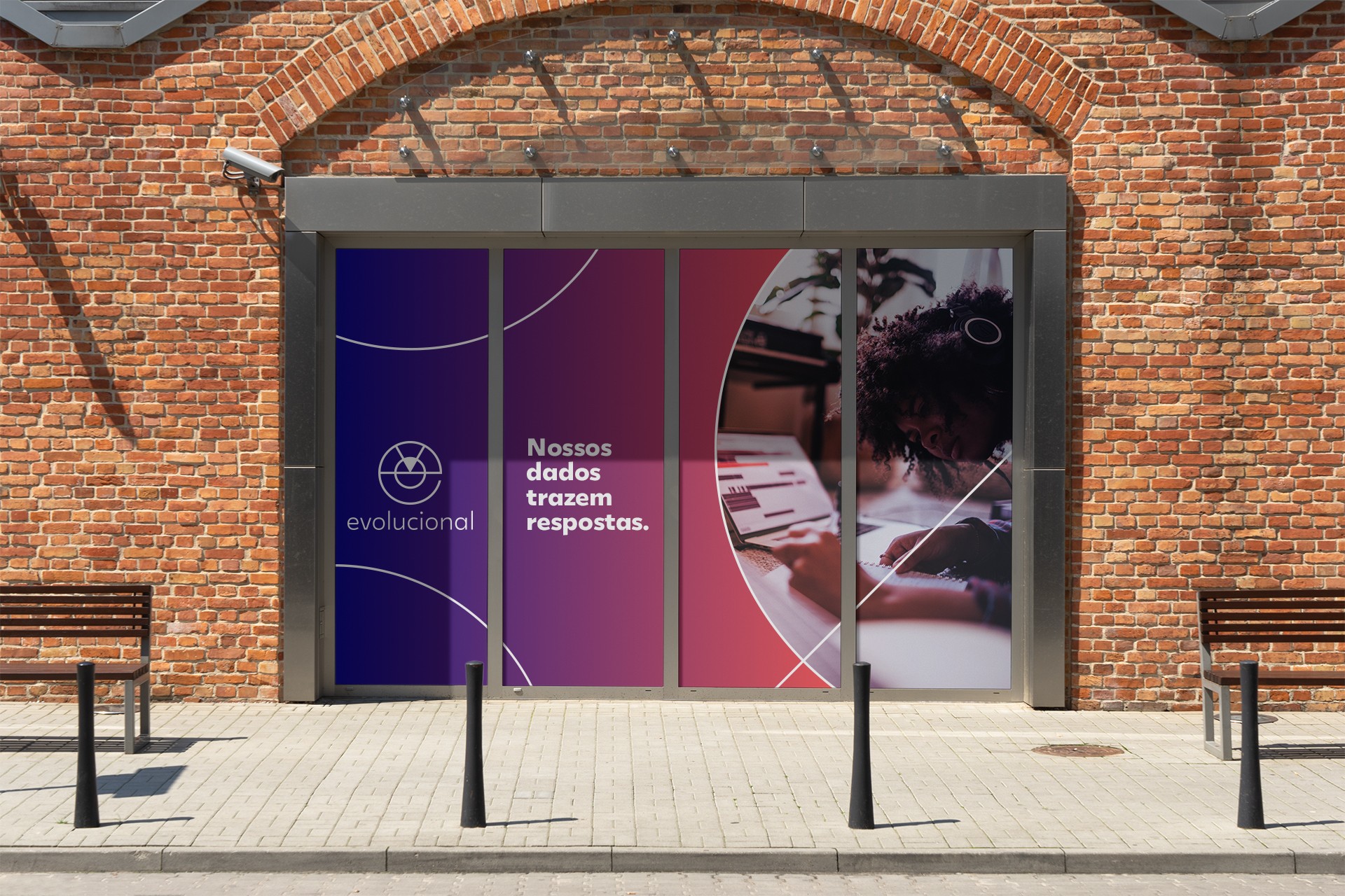
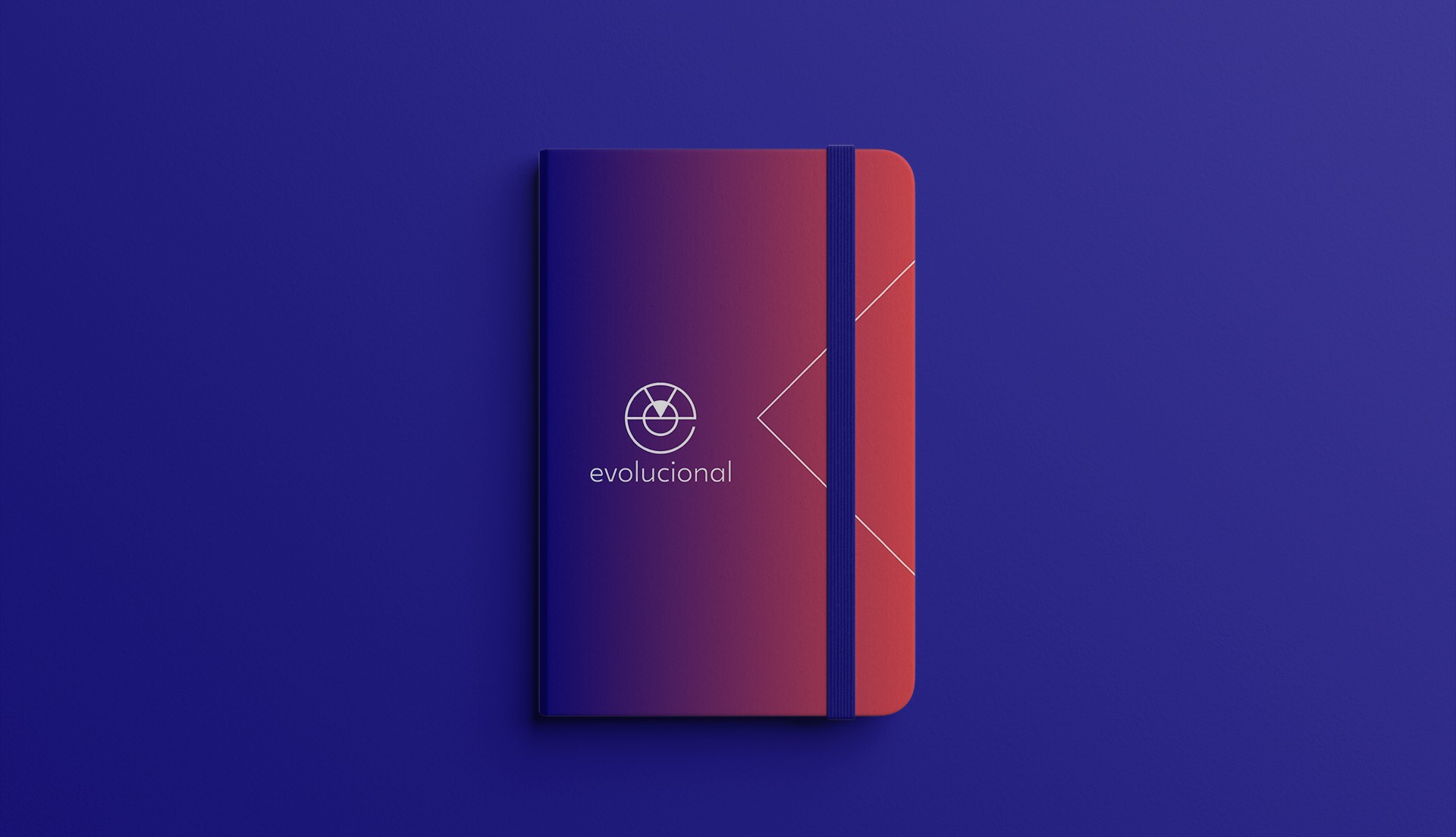
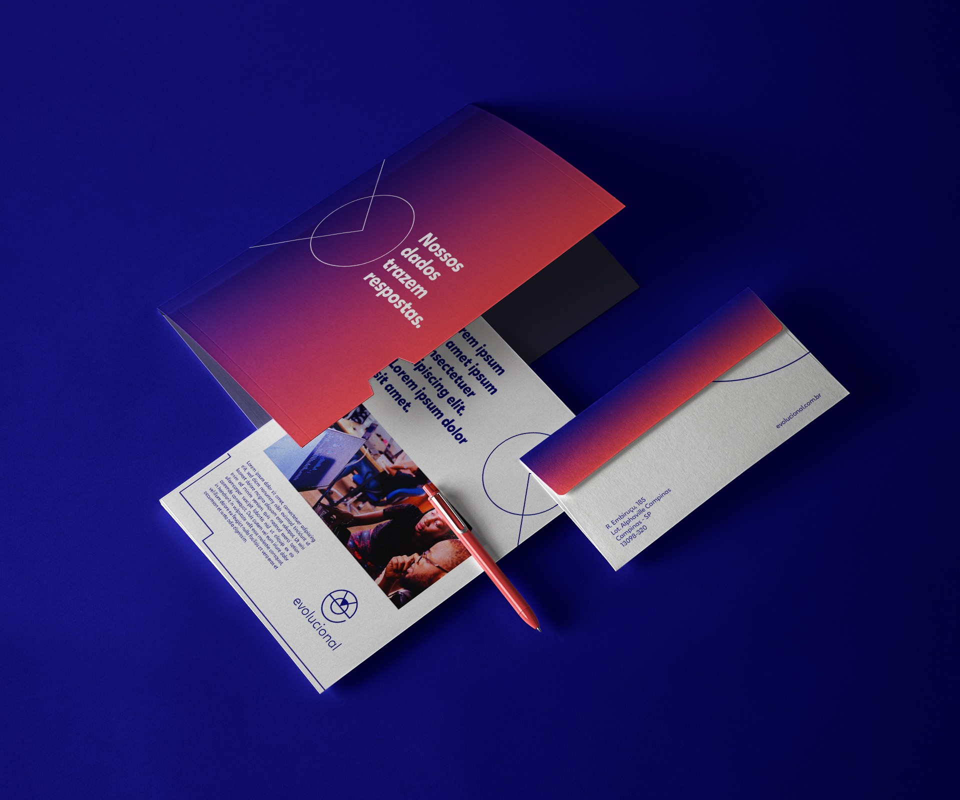
We were responsible for creating the new visual identity for the brand, transforming its entire graphic universe in connection with the technological scenario in which the company is established. Evolucional is now much more than a company that provides simulated tests to high schools. Due to its data analysis development, it can now make a deep and accurate reading of the strengths and weaknesses of a school's teaching. From this point, we brought the idea of a radar that seeks to guide educators in improving their teaching and bringing the best to their students.
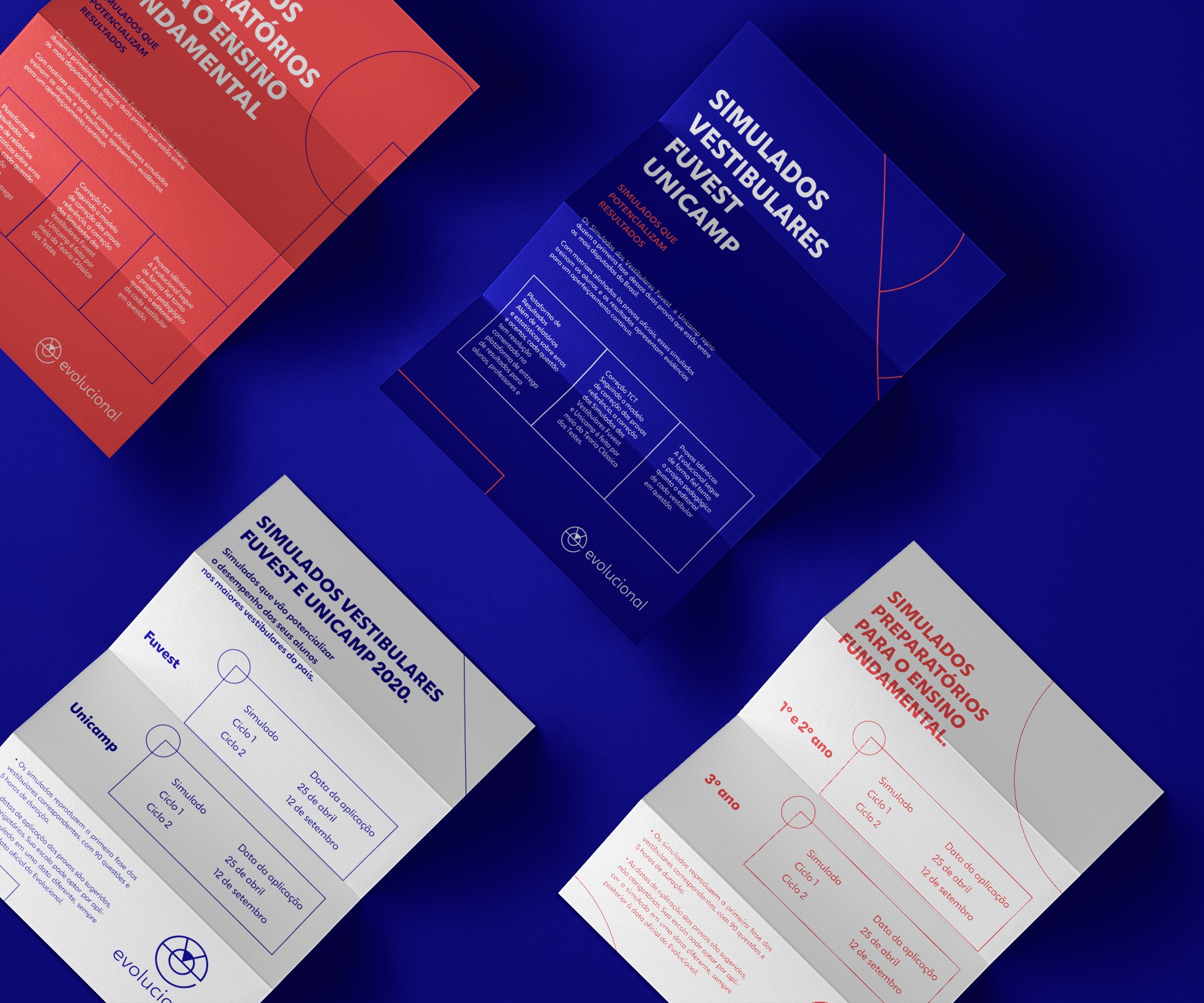
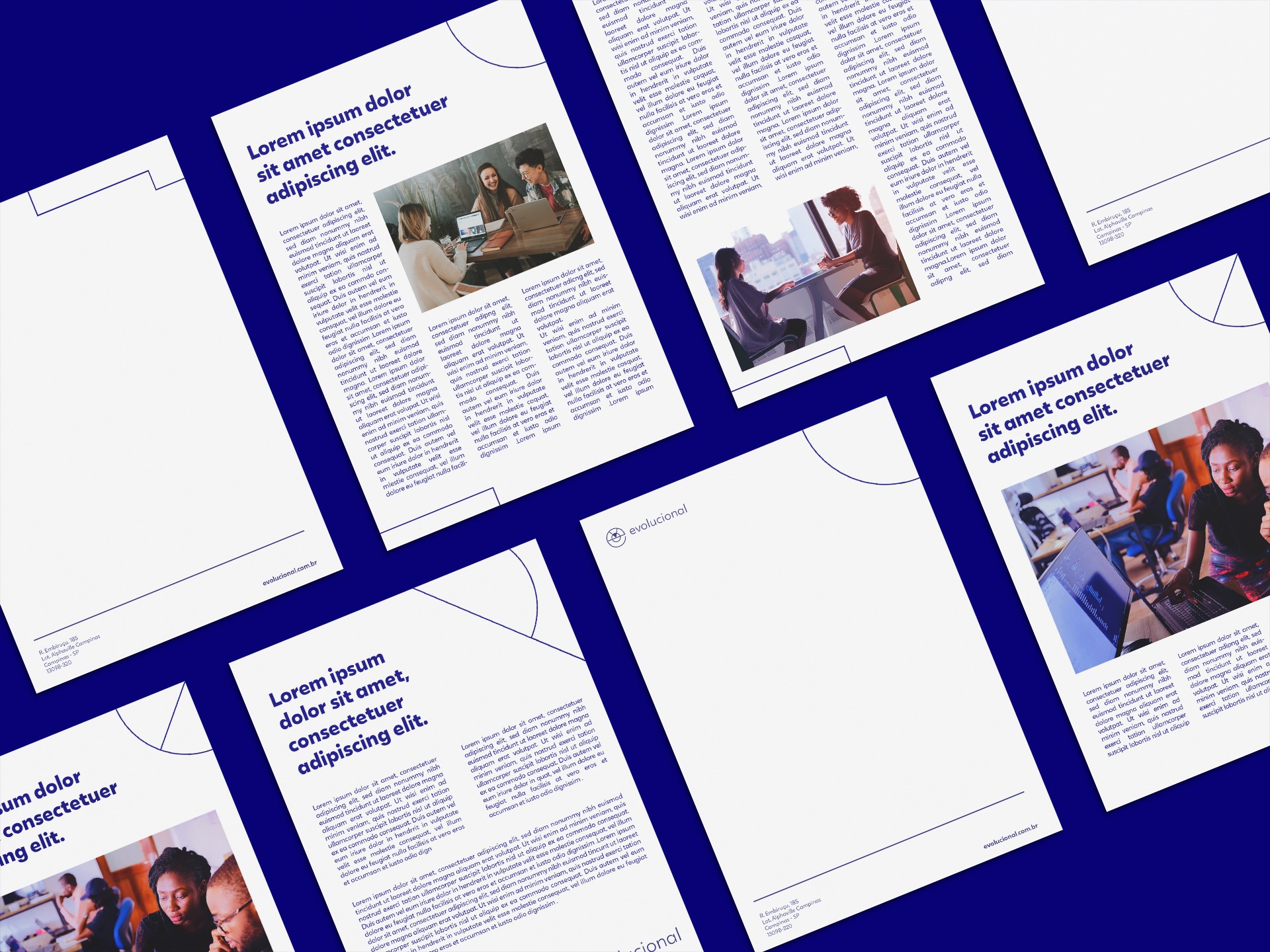
We created a grid that allows for various graphic elements - the logo is also generated from it. The radar idea refers to a 360-degree action and research, making the grid comprehensive enough to assist in the construction of layouts and all iconography.
The new color palette is more integrated with the digital environment, bringing a gradient as the main color. The other colors provide contrast and also assist in the implementation of secondary brands from the EVO family.


To further enhance this identity, we created a custom typographic family consisting of 5 different weights. A font that tries to translate the characteristics of the brand and visual universe in a cohesive and highly legible way.
The font was created in partnership with Andrea Kulpas and Marcio Freitas.