
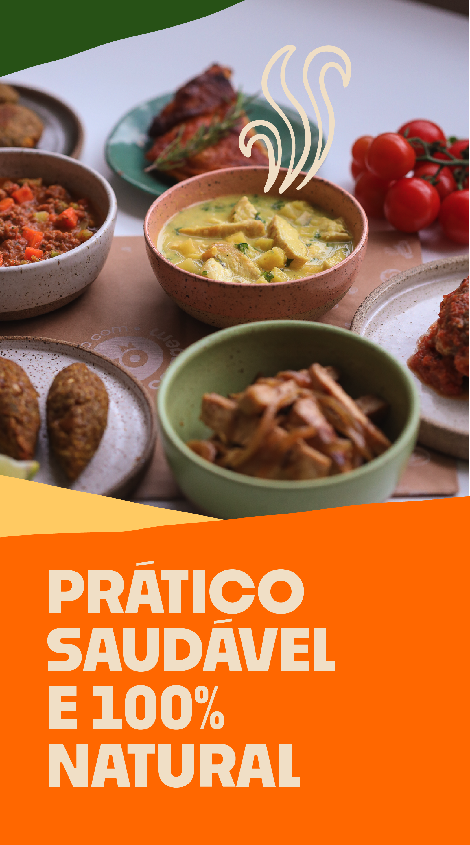
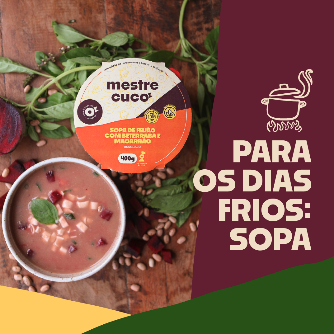
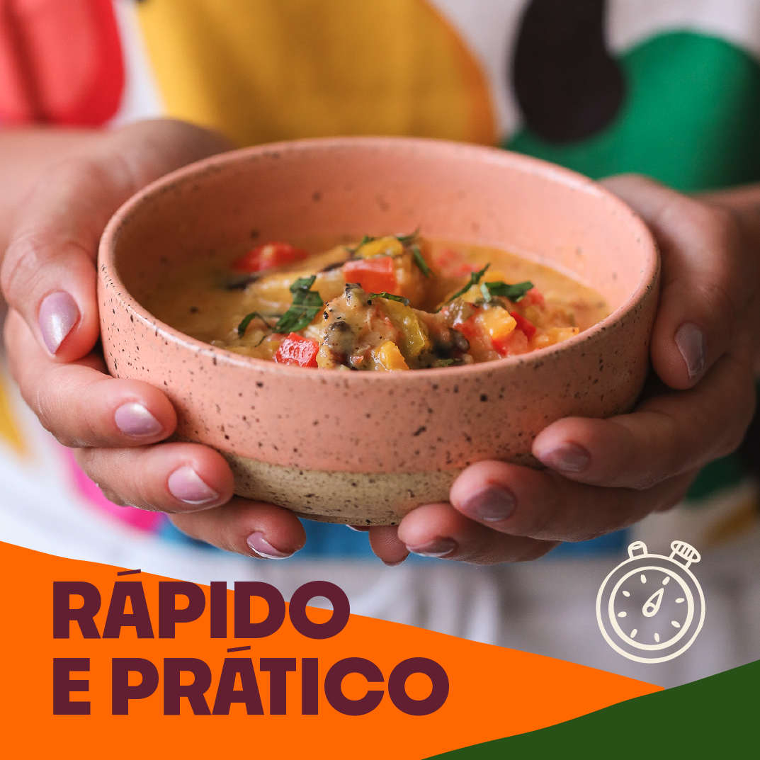
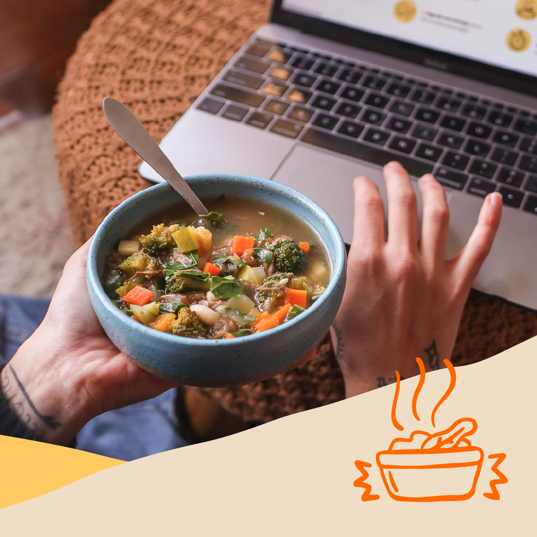
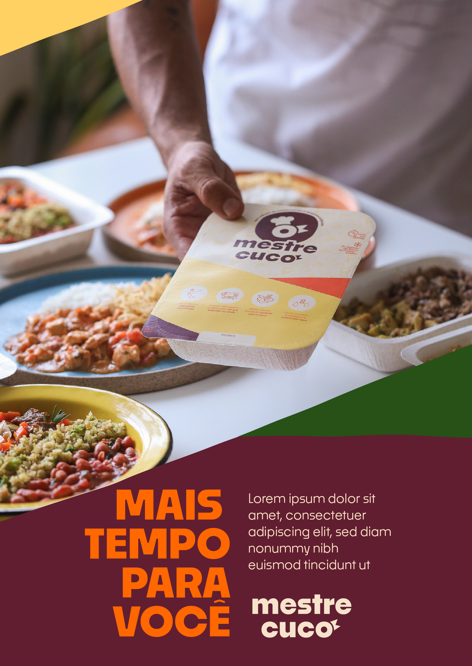
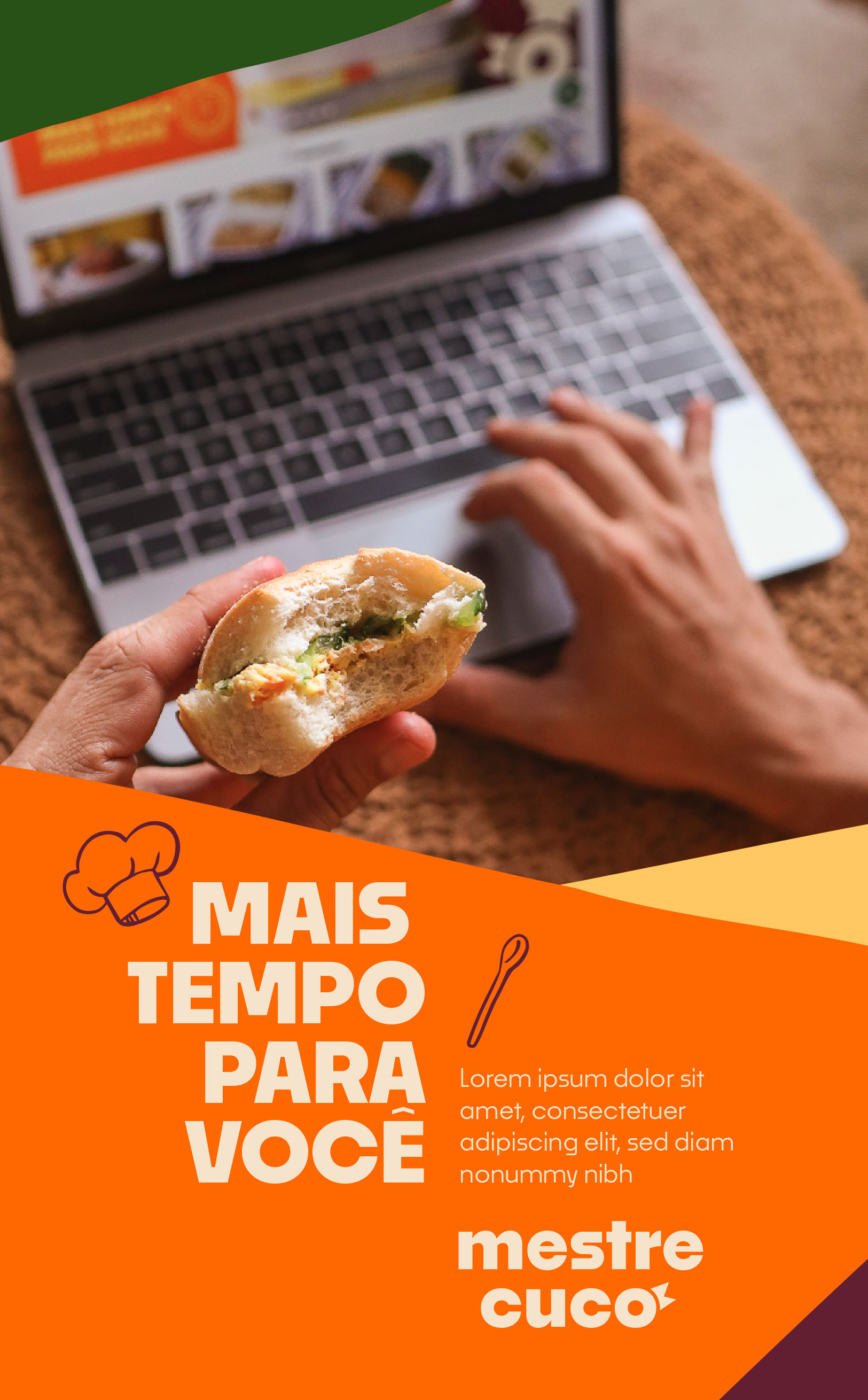
Specialized in offering balanced and healthy meals, Mestre Cuco is a delivery service that provides customers with quality food with convenience, delivered directly to their homes.
To mark a new phase of expansion and coverage, we worked on rebranding the brand in partnership with GROU Consultoria, where the strategy and visual identity were completely revamped.
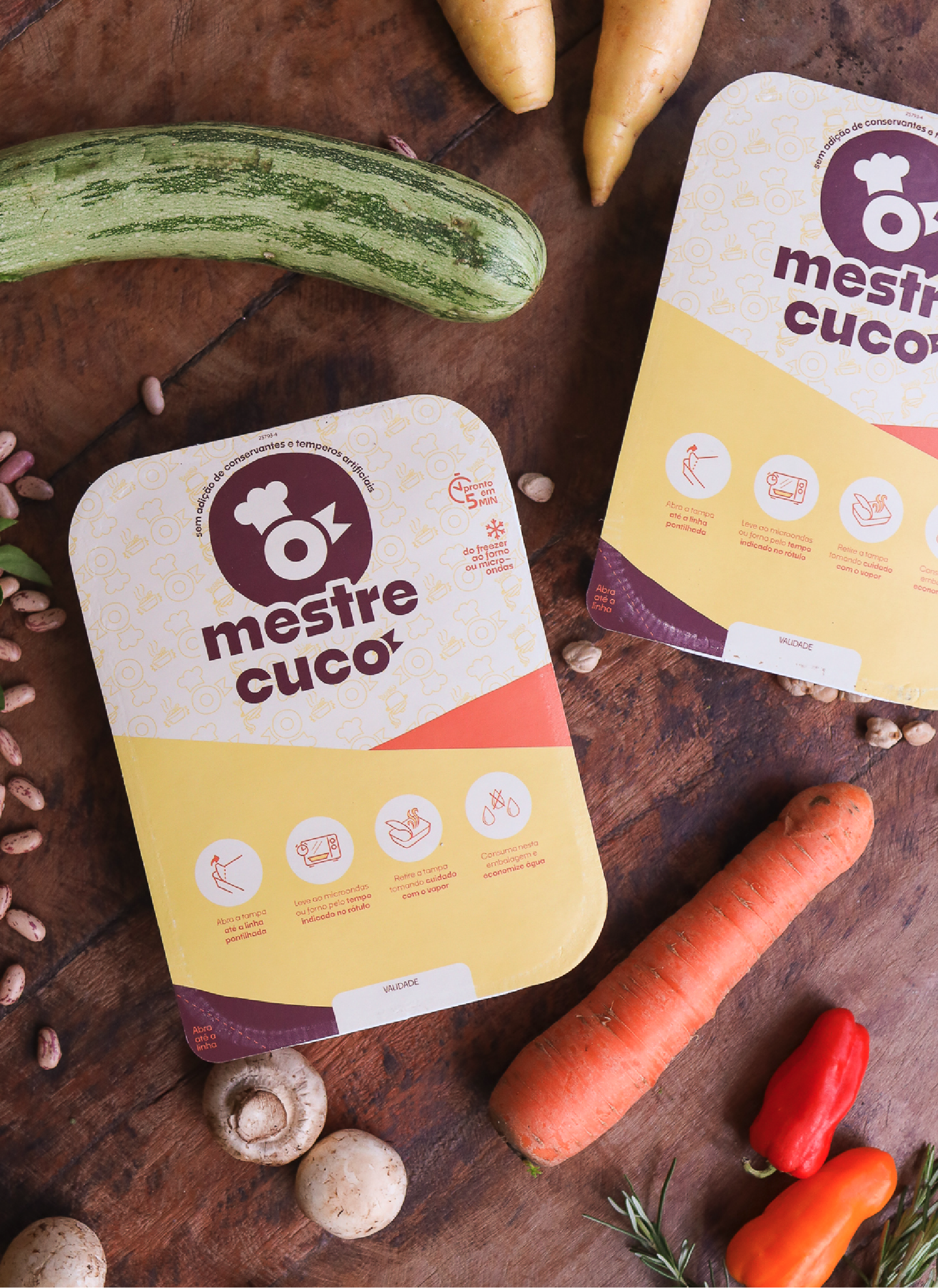
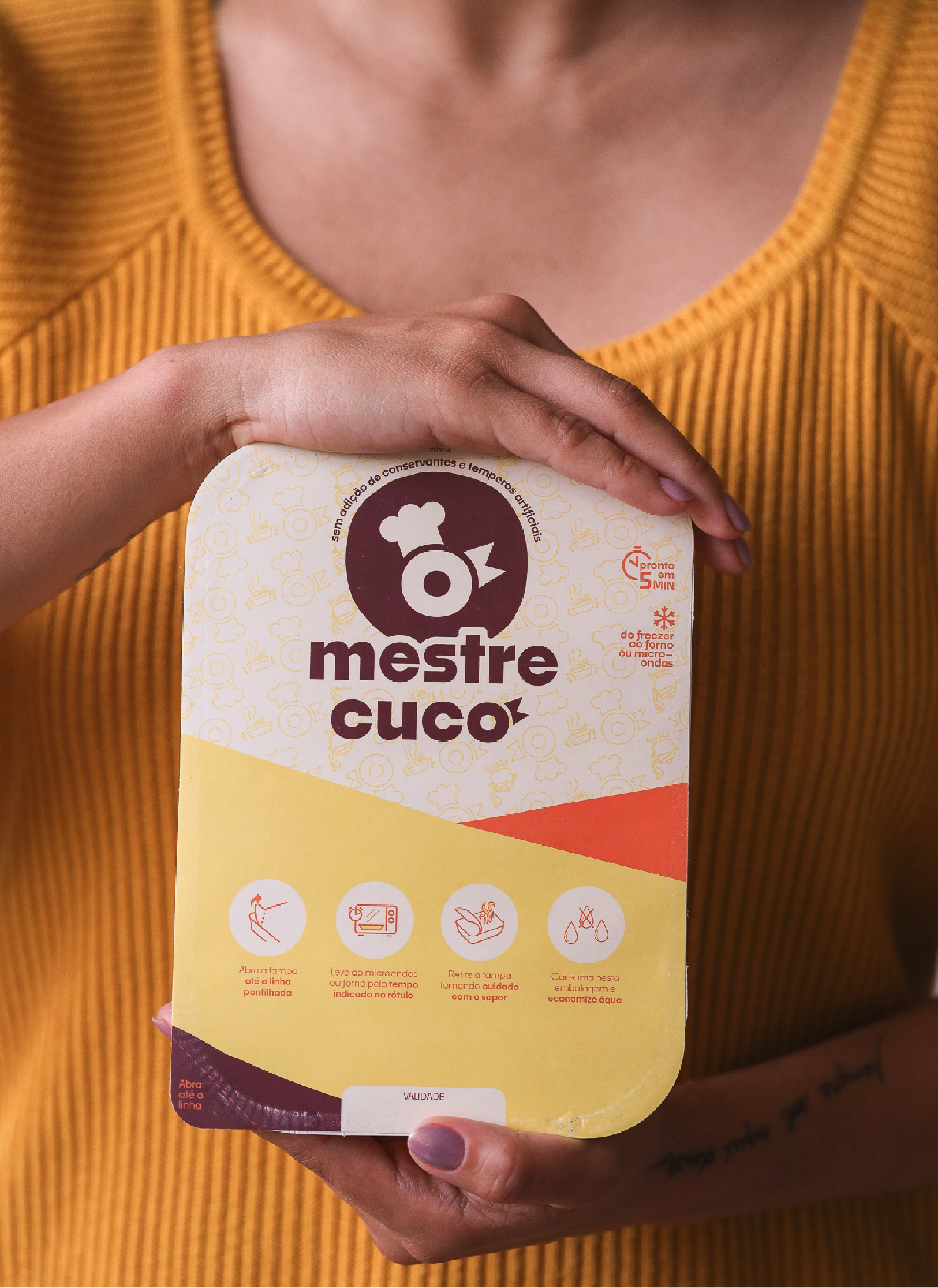
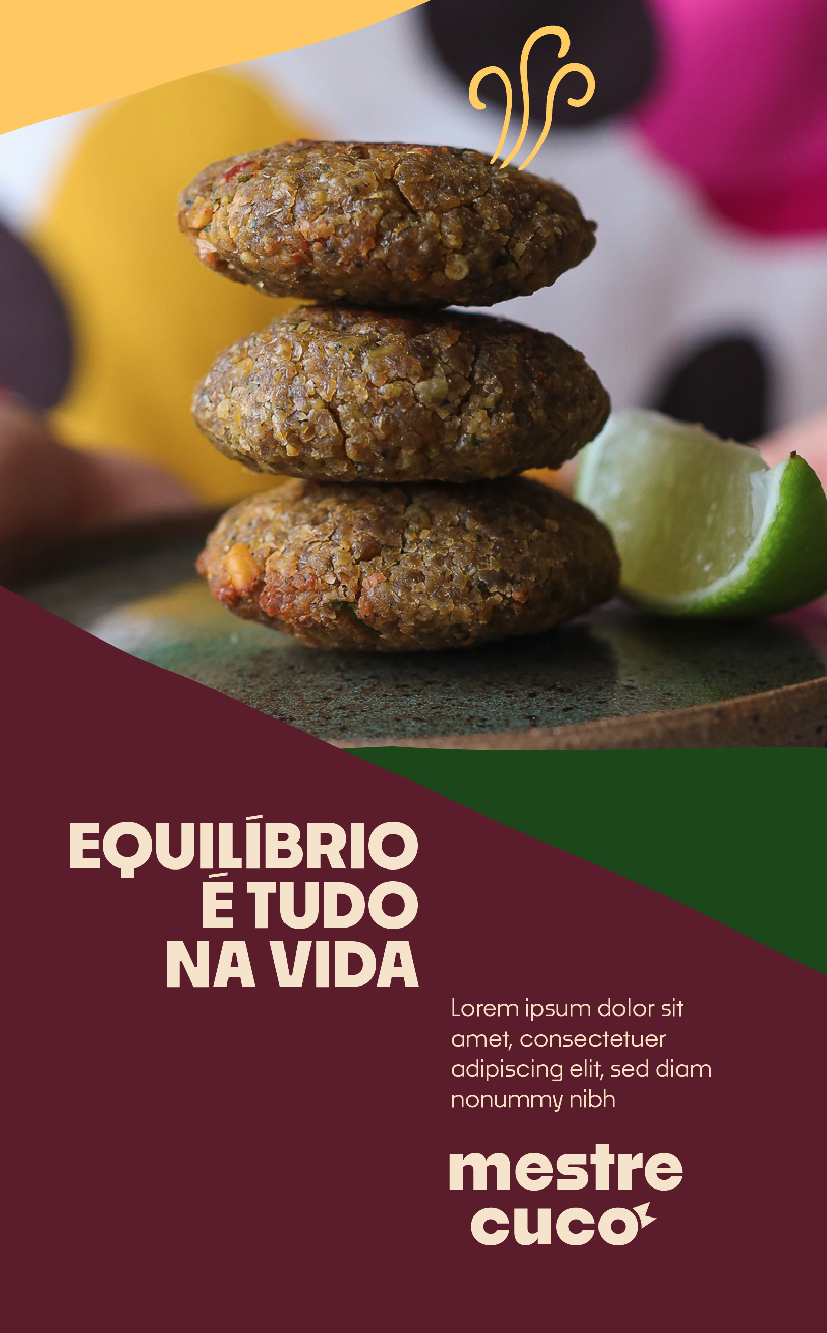
Reflecting Mestre Cuco's attitude in this transformative phase, we introduced graphic elements that overlay the layout, much like the items and ingredients of a recipe - each layer with its order and importance.
The graphic elements with irregular finishes reflect the handmade production of food, contrasting with the emphasis of typographic forms in the layouts. The NOKA typeface family, developed by BlackLetra, brings balance to the layout, along with colors, photos, and illustrations.
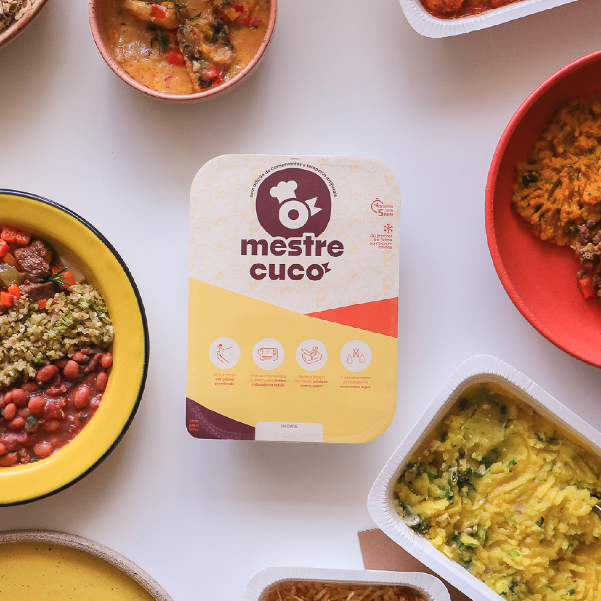
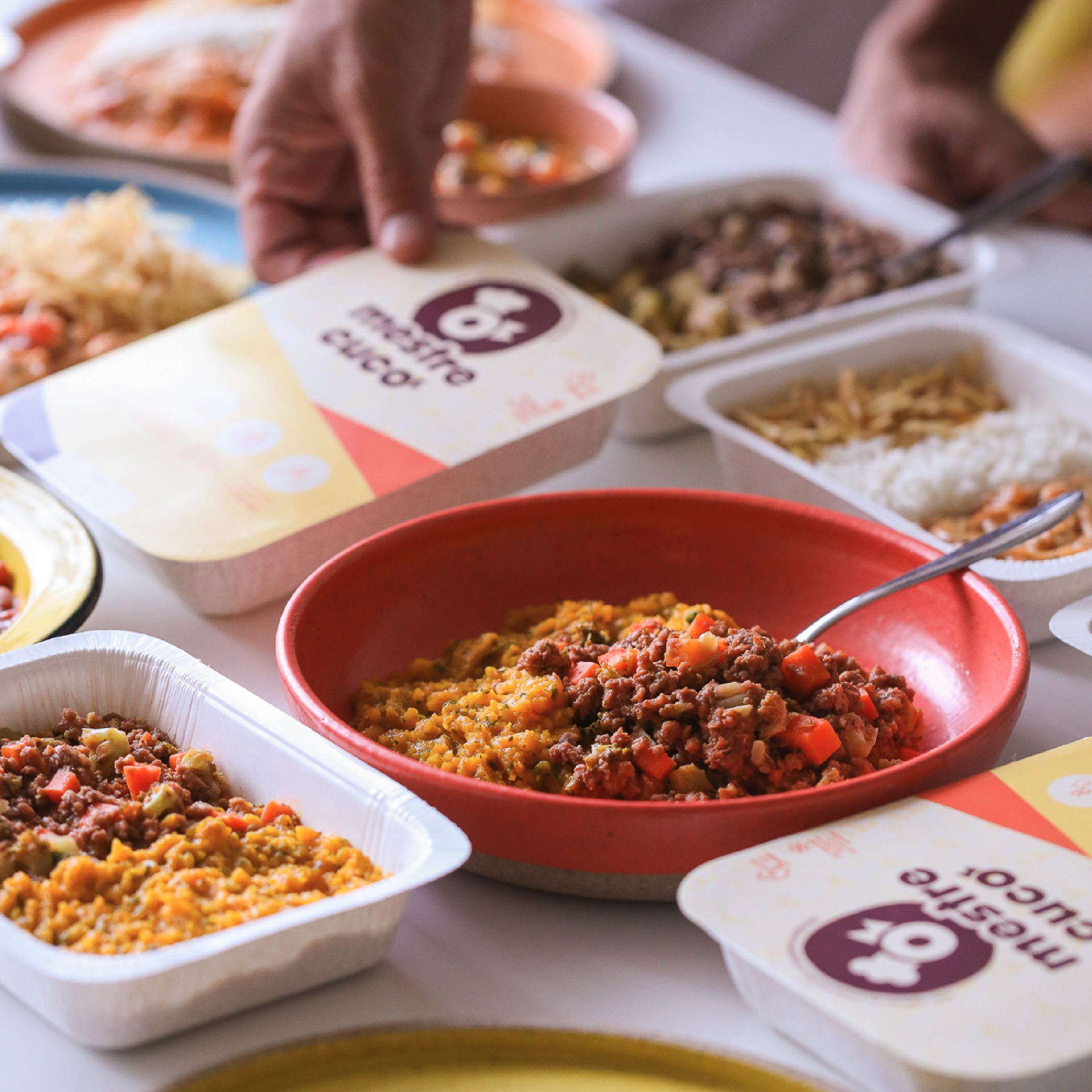
The logo subtly incorporates the Cuco element, present almost subliminally. It also has its icon version, ensuring a constant presence in the brand's communications and activations.
Illustrations, with imprecise lines and manual movement, add authenticity to the visual identity. Together with the graphic elements, irregular shapes contribute to a dynamic and identity-focused composition. This approach reinforces consistency and visual patterns, giving Mestre Cuco a graphic line aligned with its service proposition.


Team Estúdio Caxa:
Creative direciton: Vitor Brito Pereira
Design e ilustration Renato Brito Mamede e João Maiolini
Team Grou:
Leo Gonçalves e Luis Gustavo
Team Mestre Cuco:
Lucas Morais
Marcelo Pinheiro
Jessica Dias
Nicole Mesquita
Fotos: Estúdio Cumaru - Fabi Murgel