We were commissioned to develop the entire visual identity of Cachaça Tiê. In addition to the logo and standardization of the brand's visual universe, we also created its packaging and a strong, original, and proprietary brand communication.

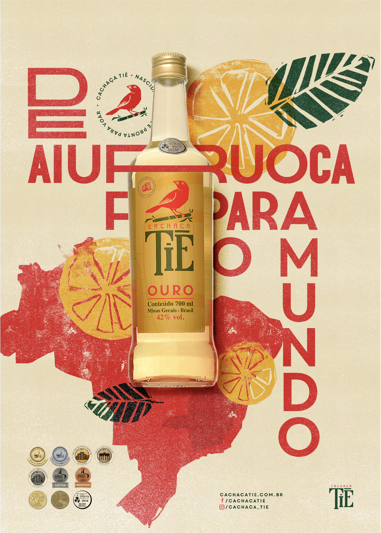
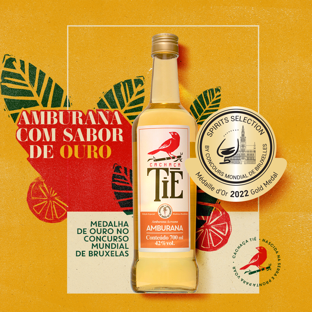
Tiê is a cachaça developed in Aiuroca, a traditional beverage-producing region in the interior of Minas Gerais. The product is known for the care in the manufacturing process and its quality, which has already earned it several national and international awards.
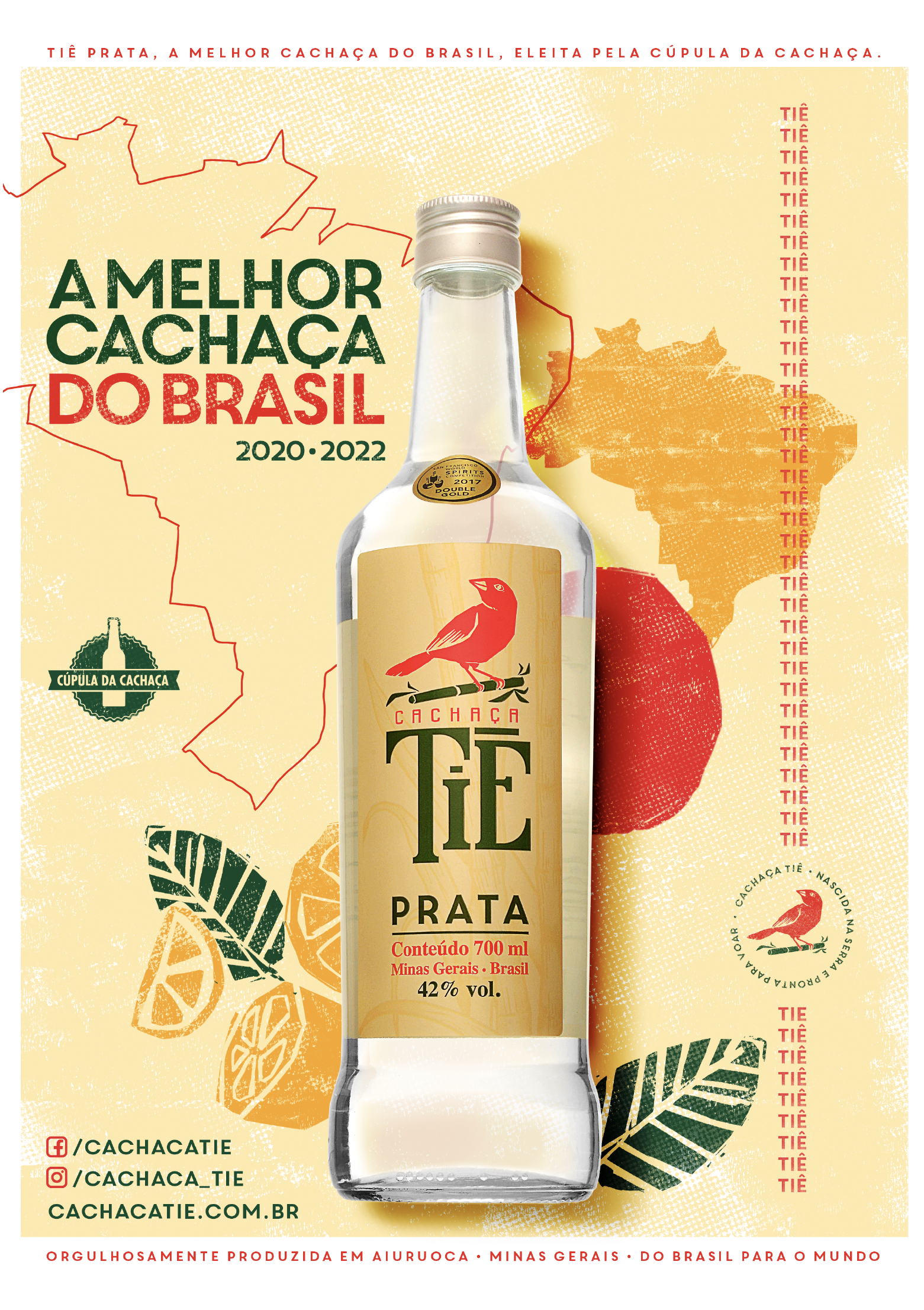
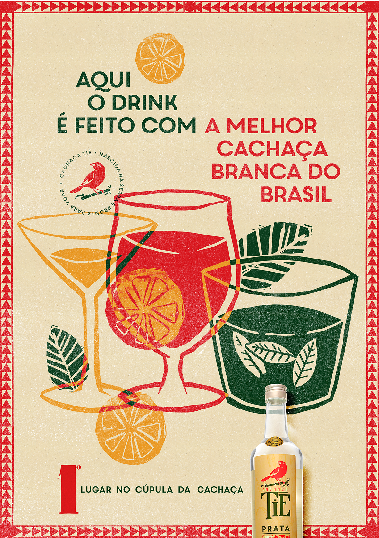
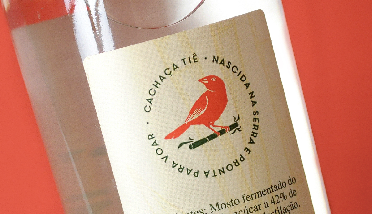
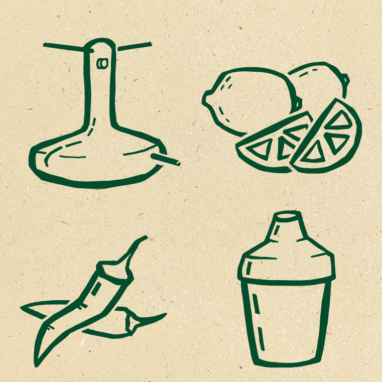
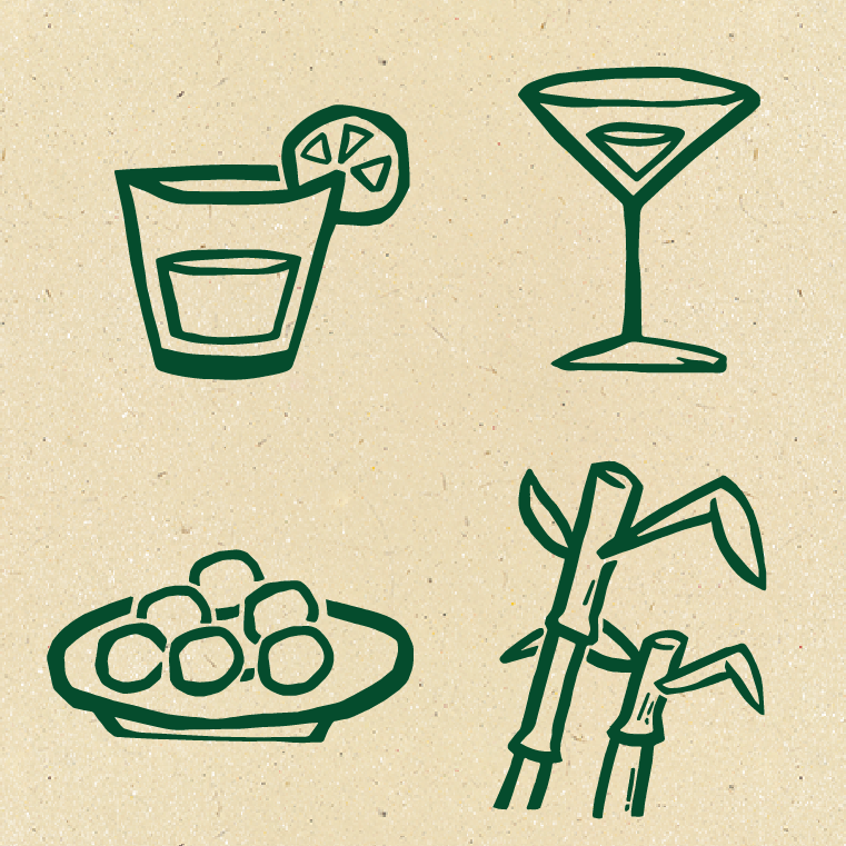
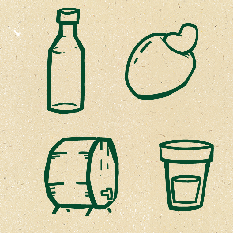
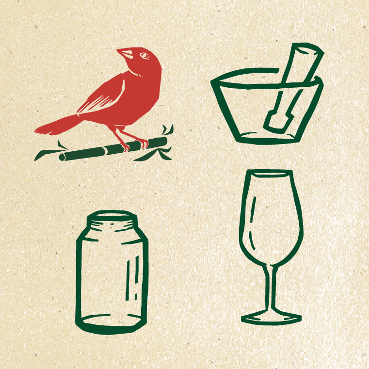
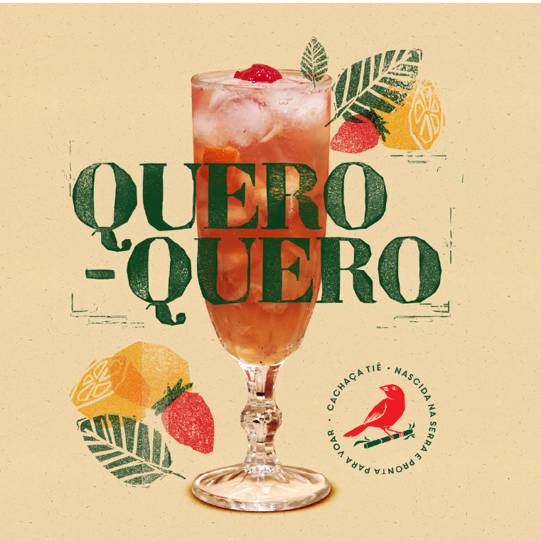
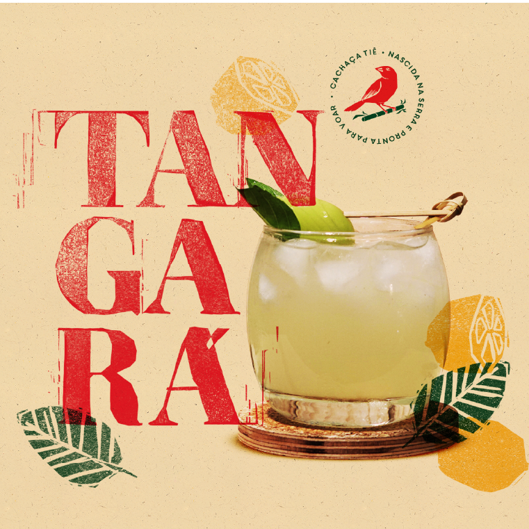
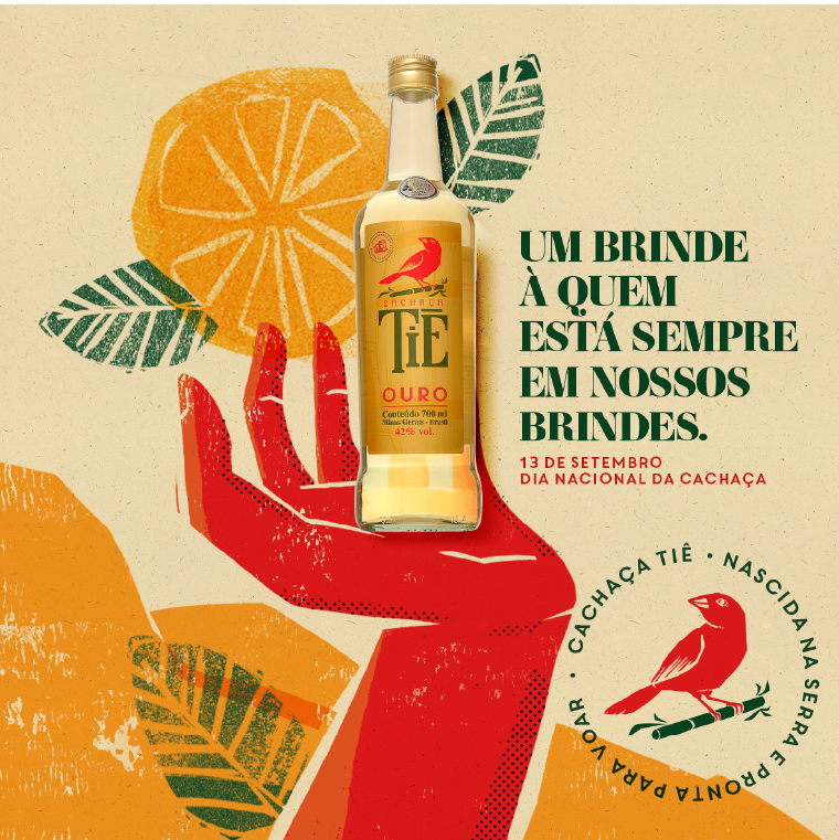
One of the brand's objectives is to disseminate the culture of genuine Brazilian artisanal cachaça production, an idea that we sought to illustrate in the project through rustic designs inspired by woodcut and Brazilian vernacular elements. This inspiration was the guiding thread of our entire creation, from the logo, where we stylized the bird that gives the drink its name, to the applications of illustrations in communication.
This type of visual unity helps to reinforce the brand's attributes and, as it is an export product, it carries a representation of the image of Brazil to the world.
The visual identity of Cachaça Tiê was among the finalists of the Latin American Design Awards 2018 and the Brasil Design Award 2018. In 2019, the project was selected for the 13th Brazilian Biennial of Graphic Design by ADG.


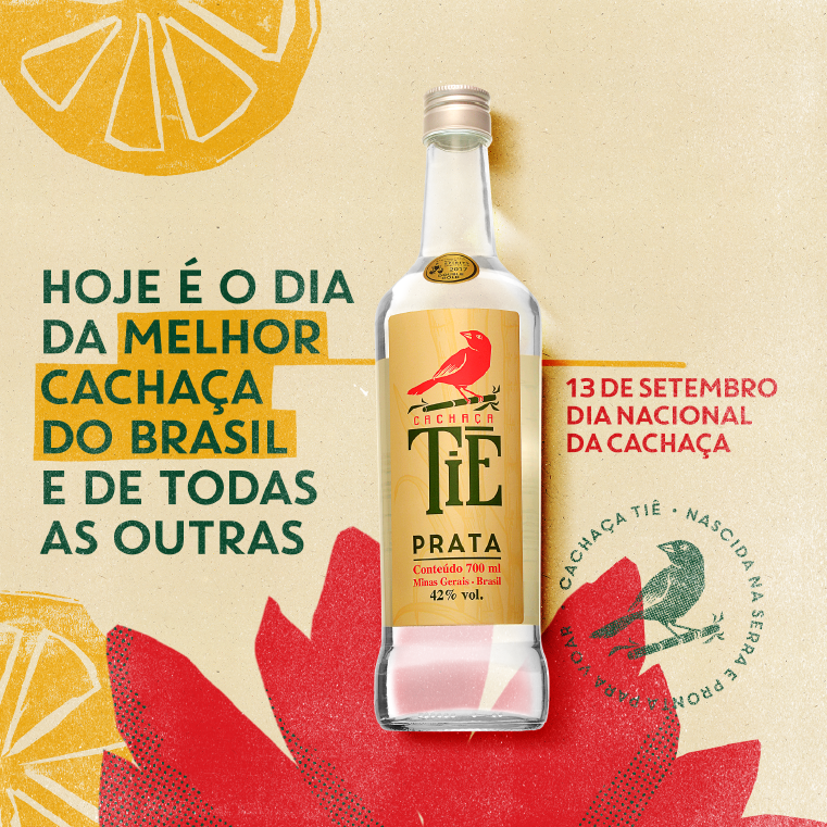
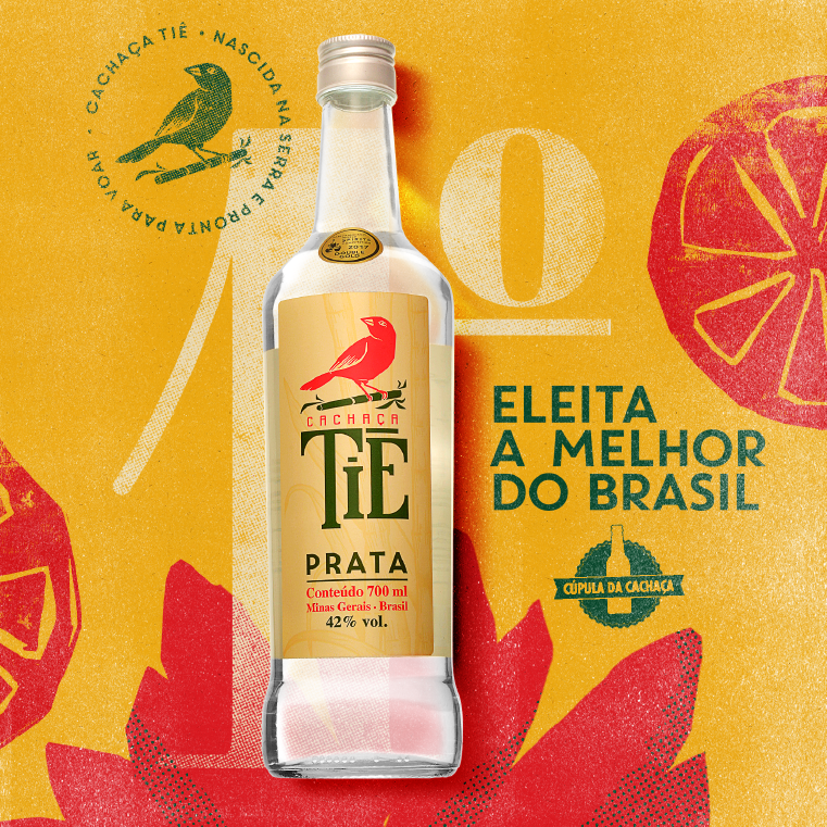

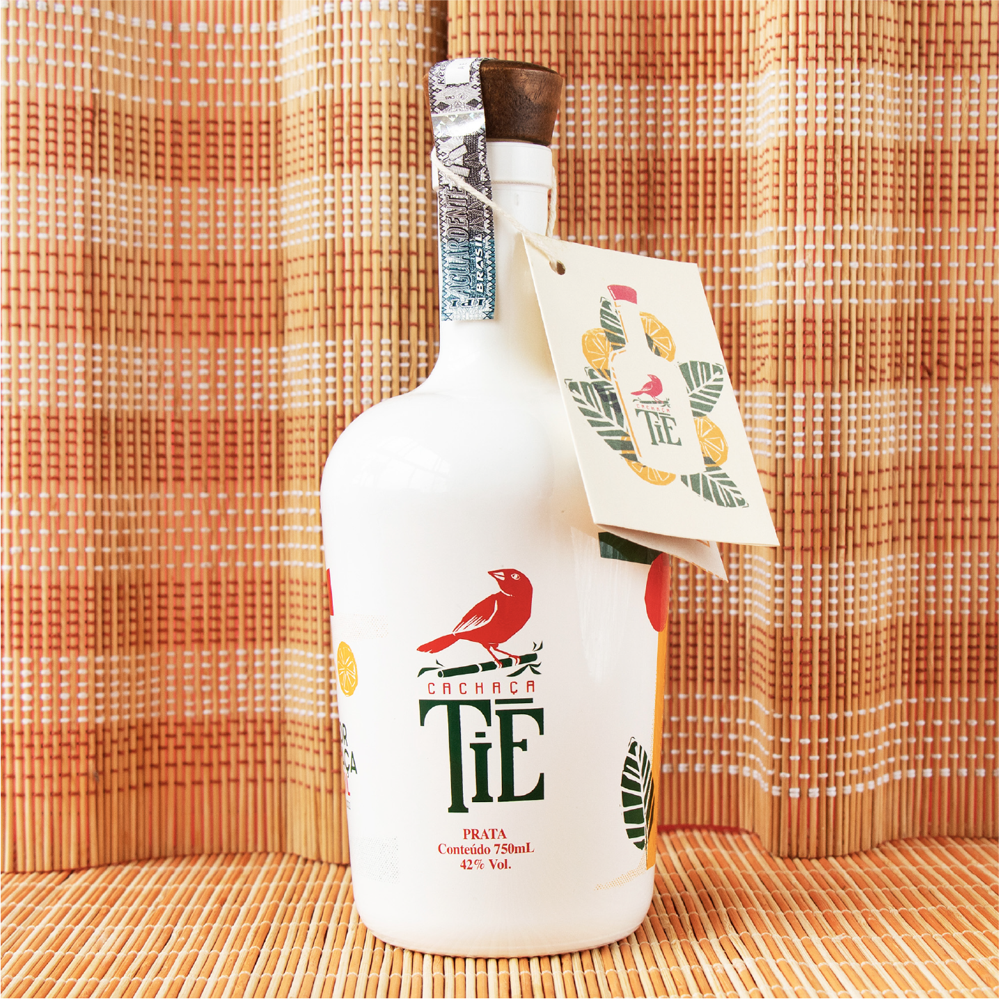
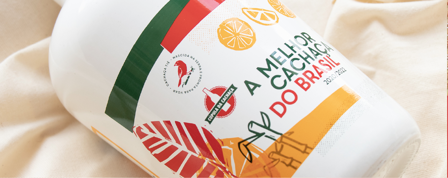
In 2020, Cachaça Tiê was chosen as the best cachaça in Brazil by Cúpula da Cachaça, the country's main award for this type of beverage. To celebrate the achievement, the brand launched a special edition, where we created a unique design printed in serigraphy. The special edition is present on the shelves of every good cachaça connoisseur.