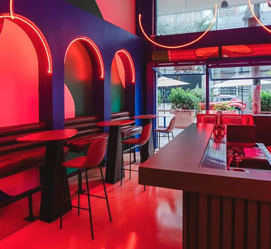
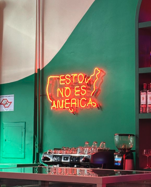
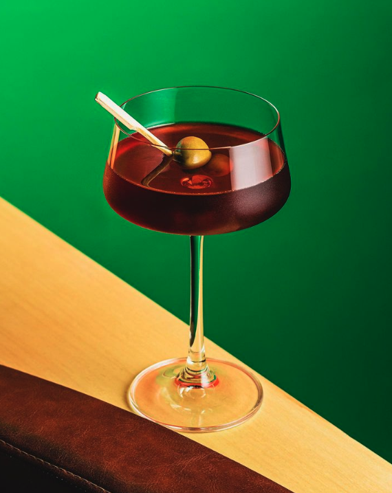
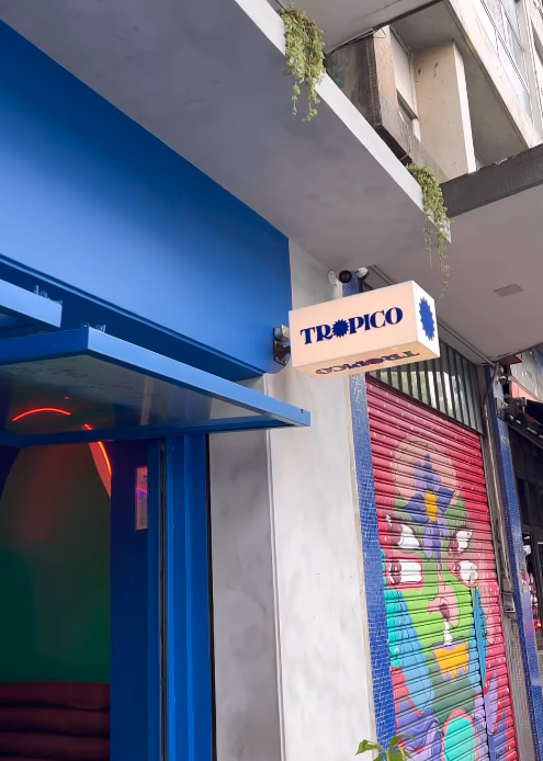
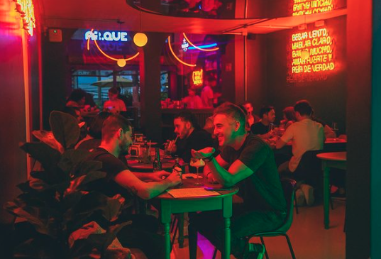
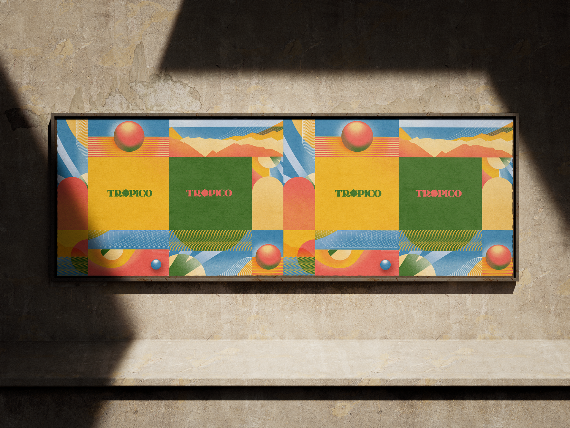
Trópico is a bar located in downtown São Paulo that offers food and drinks with influence from the tropics. The name of the establishment refers to the Tropic of Cancer and Capricorn, and the place aims to celebrate the cultures of the countries within this latitude circle. The project's briefing was to create an atmosphere that reflected the tropical essence present in the cuisine, architecture, and beverages of the bar.
The project's brief was to create an atmosphere that reflected the tropical essence present in the cuisine, architecture, and beverages of the bar.
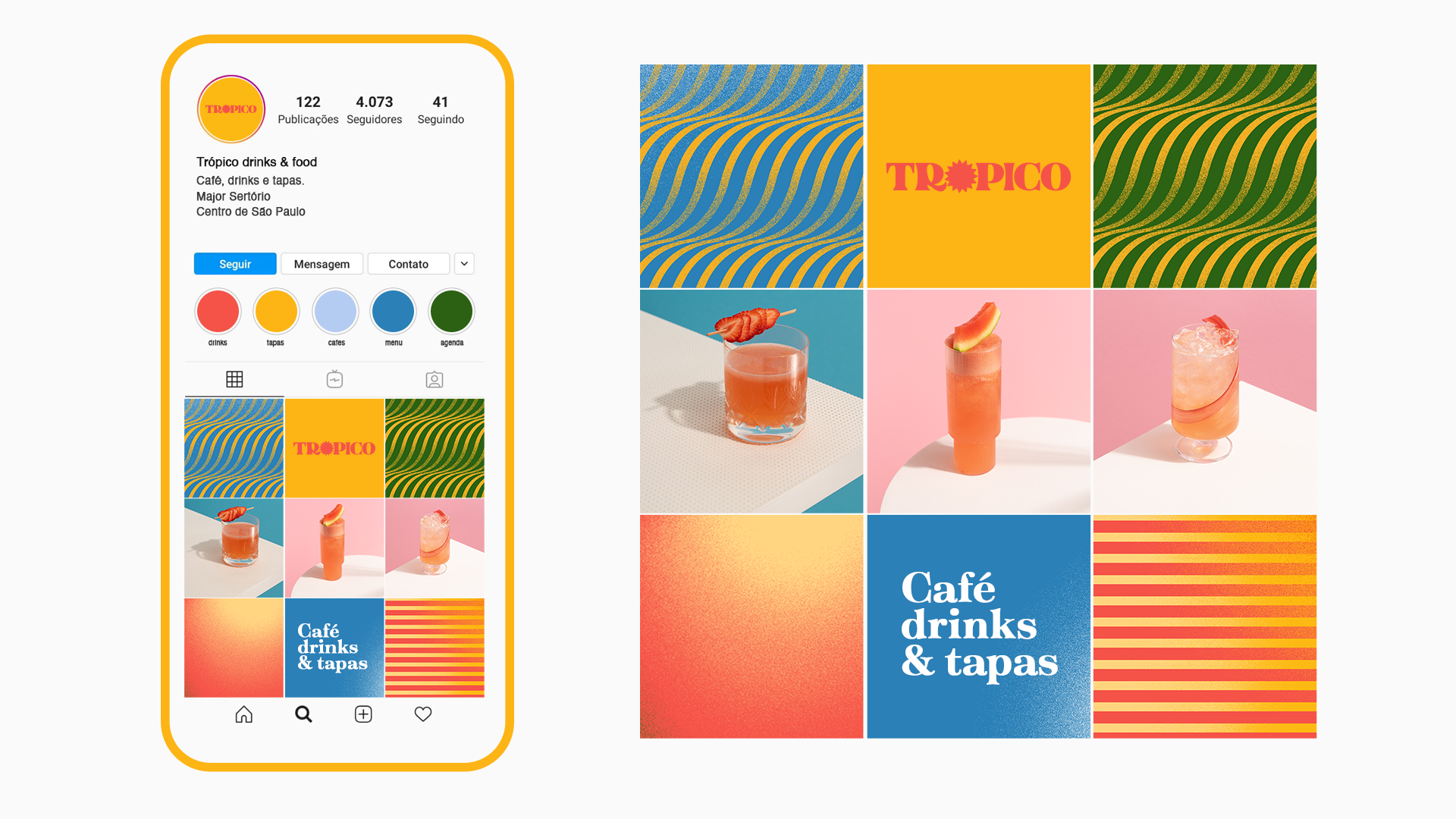
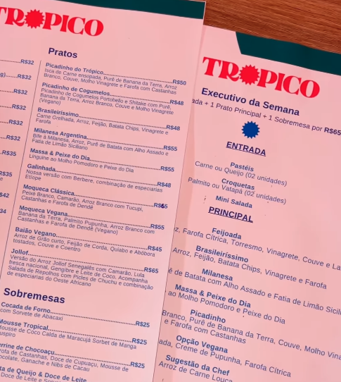
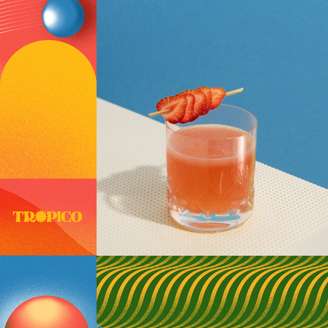
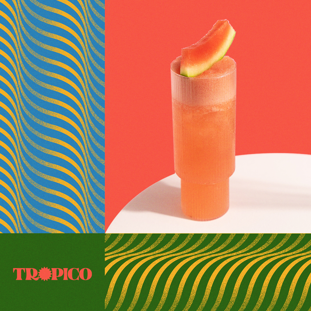
We designed a easily recognizable logo, composed of the word "Trópico" written in capital letters, with the letter "O" stylized as a sun. The logo is easily identifiable and conveys the intended idea effectively.
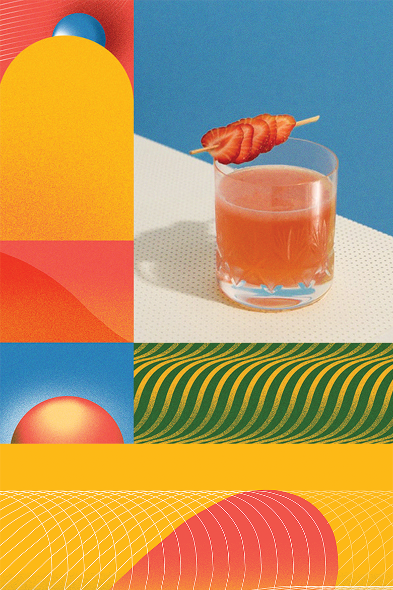
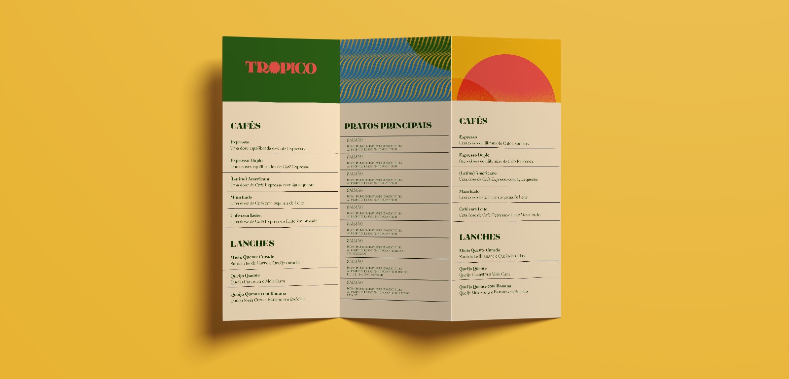
For the layouts, we created several illustrations that can be used in any arrangement when composing a design. This way, the application possibilities are almost endless. As it involves a fusion of cuisines and cultures, we opted for abstract illustrations that bring out the tropical ambiance the identity requires, while avoiding direct references to any specific country or region, and steering away from clichés such as sun, beaches, and nature. Everything is represented through colors, shapes, and textures.
To complete the visual identity, we chose the "Tenez" font, developed by Plau Design, which features organic and smooth lines, and offers a wide variety of weights and styles for use in different materials.
