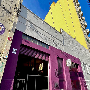
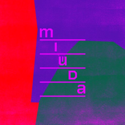
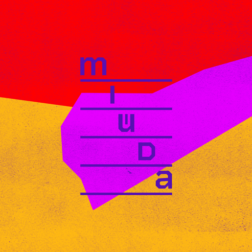
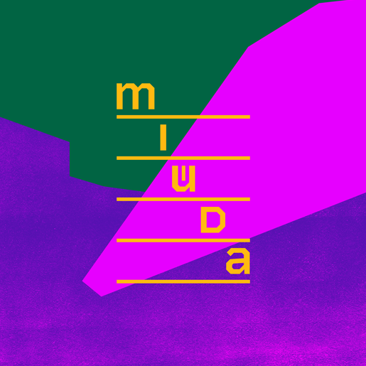
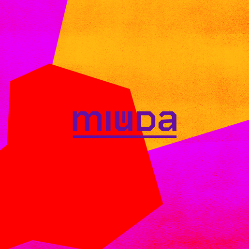
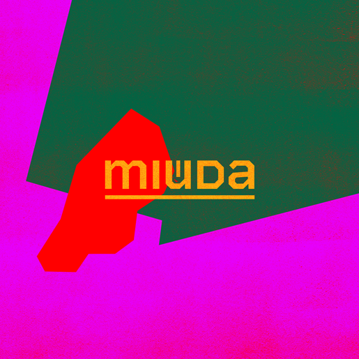
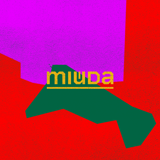
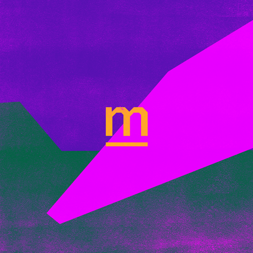
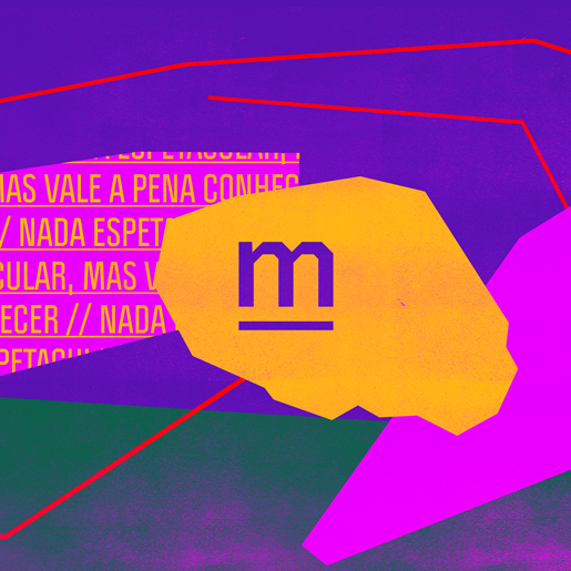
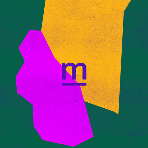
Apresentamos a nova identidade visual que criamos para o Bar Miúda, localizado no centro de São Paulo. O logotipo que criamos foi inspirado na verticalidade de São Paulo e na proposta do estabelecimento de oferecer um espaço livre e aberto para a troca, movimentação e expressão do seu público - algo raro na capital paulista. Os espaços entre as letras no logo foram propositalmente abertos para simbolizar essa ideia.
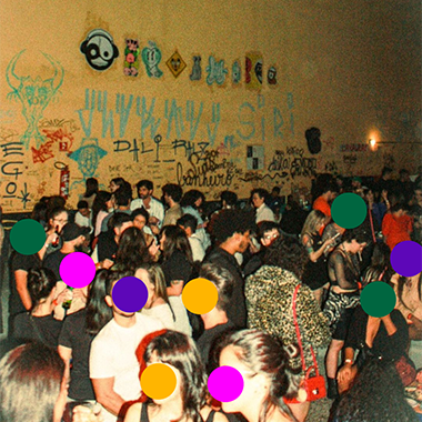
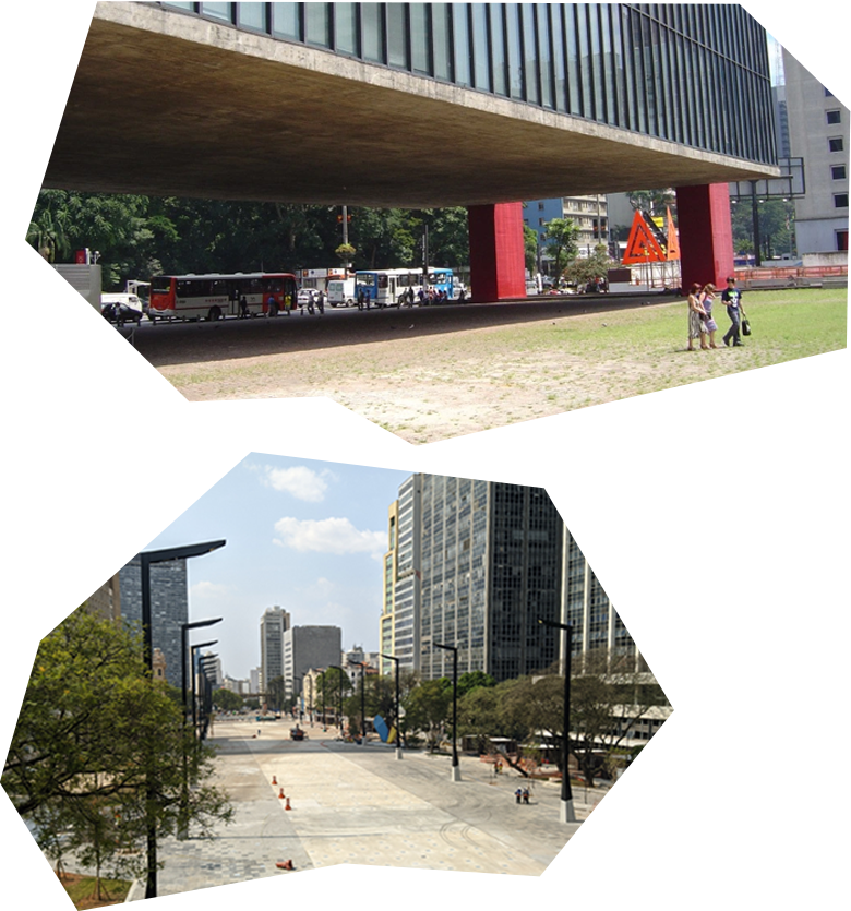
Those who live in São Paulo know how much the presence of public spaces for interaction and minimally open locations are missed.
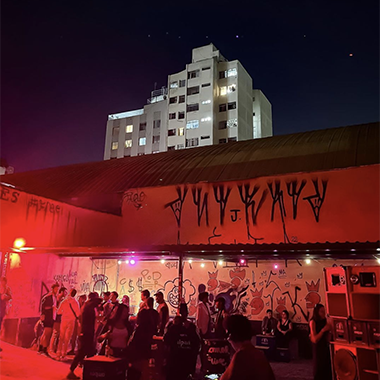
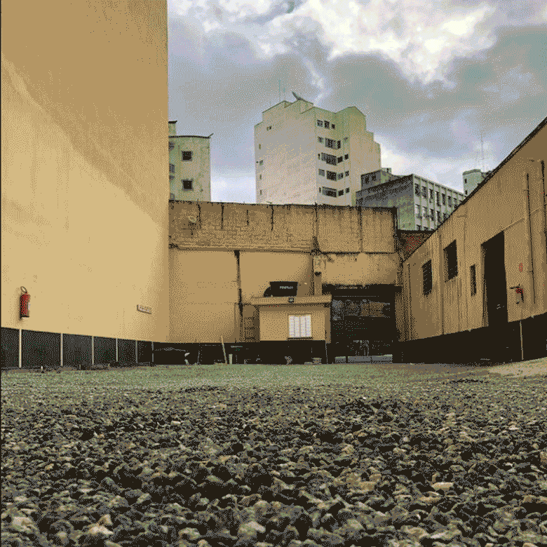
Miúda is made of concrete and asphalt, and it does not have any features that are the antithesis of the city - nor does it try to propose that. It is simply a large space that was previously used as a parking lot. And it is precisely by giving up this parking space to its public, and not to cars, that it becomes a special place - a place to express oneself, to exchange ideas, to meet and circulate.
To create the identity of the bar, we were inspired by great projects in the city that propose to be an architecture of freedom, places that invite people to occupy and express themselves freely. Without imposing any control there.

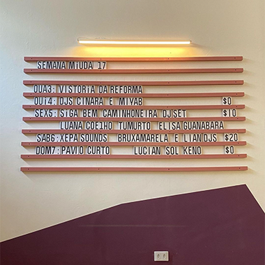
We aimed to reflect the diversity of audiences and events that are part of the Bar's agenda through the color palette, and we incorporated typography as a graphic element to represent the buzz and excitement generated by the bar. With this visual identity, we hope to help Miúda communicate its main objective to its audience, which is to be a space of freedom, exchange, connection, and celebration in the city of São Paulo.